——游憩规划——
2021And move forward together
“绝大多数的事情,并非是你想清楚以后才感觉不在乎,而是你不在乎以后才突然想清楚”
作者:间筑设计 发布时间:2022-07-14 浏览量: 次
空房间 - 雕塑家个展设计说明
2019年底,受雕塑家蒋晟的委托,我们去北京为他的新展“空房间”进行展览设计的前期现场考察。展览选址在北京朝阳区的山下学堂一层小剧场——“黑匣子剧场”,地处紧邻京城森林公园的一处创意园中。
At the end of 2019, we were commissioned by the JIANGJIABAN to travel to Beijing for a preliminary site visit for their new exhibition "VOID". The site of the exhibition is the "Black Box Theater", a small theater on the first floor of The Dome Studio in Chaoyang District, Beijing. It is located in a creative park adjacent to the Olympic Forest Park.
.jpg)
此次为间筑与蒋晟的第三次合作,而“空房间”也是蒋晟在创作和精神旅途中的转折点。在这个名为“空”的房间里,众多元素“满溢”,譬如他常用的琉璃材质,通常多为明澈剔透,在“空房间”内却以高饱和度的实心色调呈现。
As the third collaboration between TEAM_BLDG and Jiang Sheng, the "VOID" is also a turning point for Jiang Sheng in his creative and spiritual journey. This room was named "VOID" but was“overflowed”with numerous elements. For example, Jiang Sheng adopted a lot of solid and highly saturated materials in "VOID", instead of the crystal class glass material that he consistently used for his work.
走道尽头的“戏剧空间”"Theatre Space" At The End of The Corridor
从山下学堂的北侧大门进入后,我们先来到了山下咖啡厅轻快明亮的开放空间,而穿过正对咖啡馆的剧场大门,我们毫无转折过渡地进入了一个具有强烈戏剧属性的封闭空间。当我们第一次走进剧场时,最先感受到的是空间上的交流与融合、冲击与矛盾。
After entering from the north gate of the The Demo Studio, we first came to the joyful open space of The Demo Café. After passing through the theater door facing the cafe, we smoothly entered an enclosed interior space with strong theatrical attributes. As soon as we stepped into the theater, we were amazed at the impact and ambivalence of spatial communication and integration.
.jpg)
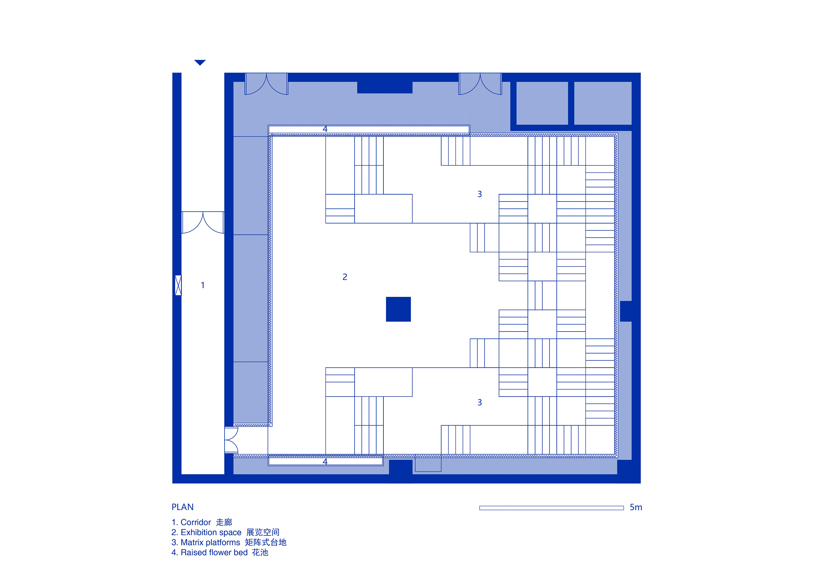
我们一方面希望保持剧场现有蒙太奇般的戏剧属性,另一方面也希望能够通过入口过渡空间的设置柔化观众的观展体验。于是我们决定将展览的出入口设置在原剧场作为后勤使用的侧门:一条狭长走道的尽头。
On the one hand, we hope to maintain the existing montage-like dramatic attributes of the theater, and on the other hand, we also hope to soften the visitor's experience of the exhibition through the setting of the transition space at the entrance. So we decided to set the entrance and exit of the exhibition at the side door of the theater, which was originally for logistical purpose, at the end of a narrow walkway.
.jpg)
132个立方堆出个“空房间”132 1m X 1m Cubic Units Stacked in VOID
如何在有限的空间内制造更多观众与展品的互动,也是我们思考了很久的问题。区别将展品放置在特定展台上的传统展陈方式,我们希望我们设计的展览空间能够消除展品与观众之间距离。
We have been thinking for a long time about how to create more interaction in between visitors and exhibits in a limited space. Unlike the traditional method of placing exhibits on a specific stand, we hope to design an exhibition space that eliminates the distance between the exhibits and the visitors.
.jpg)
.jpg)
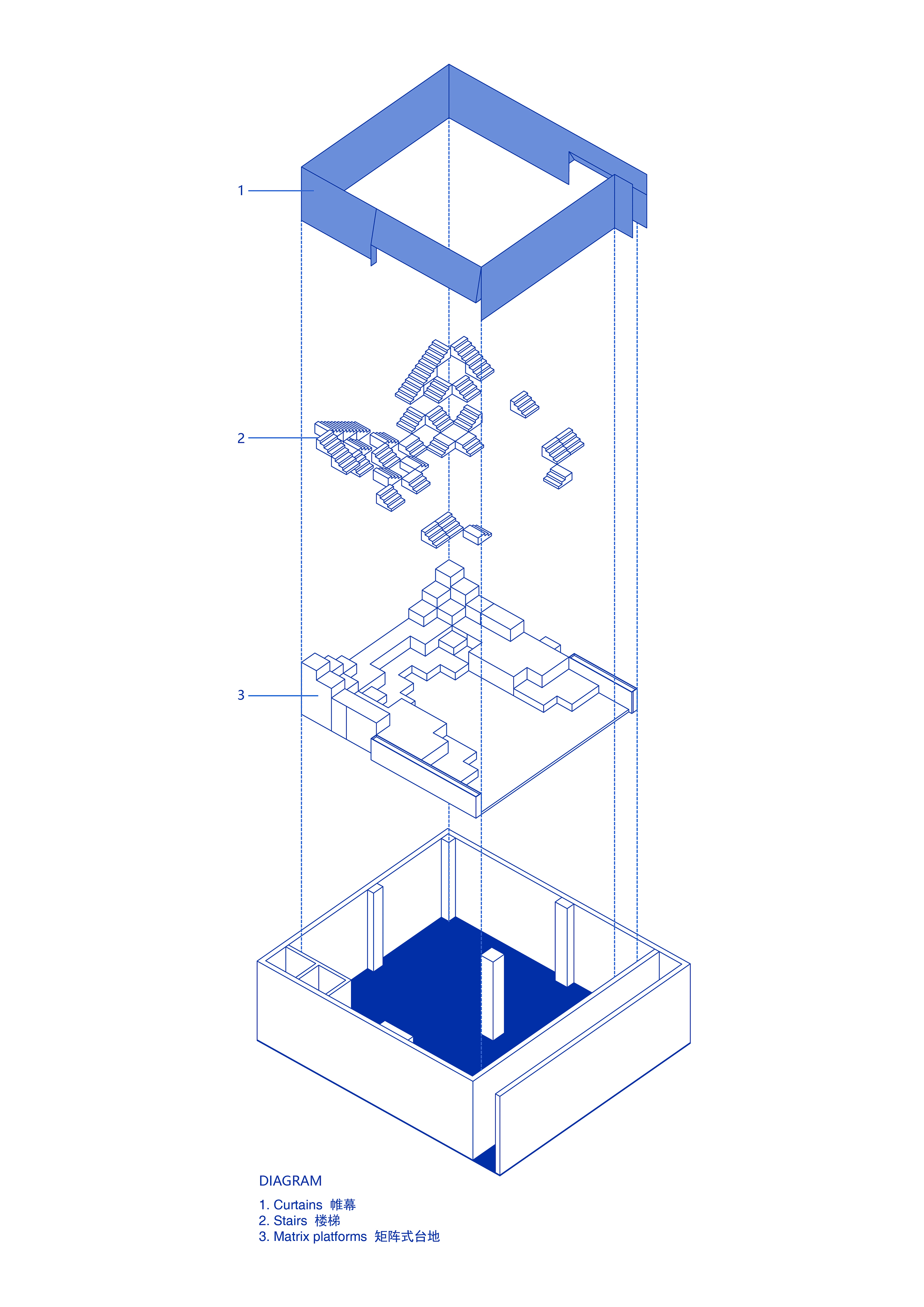
受印度阶梯水舍的启发,我们决定抛弃色彩属性,去除装饰性元素,用简单的几何形状在场地中搭建出层叠的秩序感——一个戏剧般的,只拥有起伏地形与空气的“空房间”。矩阵式的台地由132个1米x1米的立方单元堆叠组成。我们充分利用场馆高度,将空间尽头处的台阶延伸至了几乎触碰到的天花的位置。在空间构成上,我们并没有设置任何硬性隔断,展品可自由放置于台地之上,并通过灯光的明度深浅与放置佛像的点位对观众进行“柔性”的指引。观众在高低起伏的地形之上自由行走时,与展品的关系时近时远,时而与展品平视,时而会发觉展品在高处。所以真正决定观展路线的是观众的偏好。
Inspired by the Indian stepwells, we decided to design the space without color attributes and decorative elements. Using simple geometric shapes to create a layered sense of order in the site - a dramatic "empty room" with only undulating topography and air. The matrix platforms consist of 132 1m x 1m cubic units stacked on top of each other. We raised the steps at the end of the space to the height where people almost touch the ceiling, making full use of the height of the space. We did not set any rigid partitions in the space, so that the exhibits can be freely placed on the platforms. The visitors are guided "flexibly" through the light and shade of the lights and the placed Buddha statues. When the visitors walk freely on the undulating platforms, the distance between them and the exhibits is sometimes close, sometimes far away, and the exhibits is sometimes at eye level, sometimes on the high ground. So, what really determines the route of the exhibition would be various preferences of different visitors.
.jpg)
.jpg)
.jpg)
.jpg)
正如本次展览的策展人闻清所评论的:“间筑设计构建的‘空房间’展场,就像一个无始无终的循环阶梯。设计师肖磊完美地利用空间的高低落差,将场地错落搭建,给予观者仰视、俯视、平视的多种观感。在空房间里,人们既是观众又是景致,可以说是 ‘身在其中不知何物,跃于图景豁然开朗’。”
As the exhibition curator Youpo commented: “The 'VOID' exhibition space designed by TEAM_BLDG is like a circular staircase without beginning and end. Designer Xiao Lei perfectly utilized the height of the space to build the site in a staggered manner, providing the viewers with a variety of viewing angles: sometimes the Buddha statue is in the high place; sometimes in the low place; sometimes at the eye level. In the “void” exhibition space, people are the viewers and also the view, so to speak, 'being in it and not knowing what it is, leaping out the picture and being enlightened'."
.jpg)
.jpg)
一些物件 Some Objects
同时,我们为展陈的佛像特别设计了两款佛龛,旨在为这在人们刻板印象中庄重肃穆不可近的器件增加一些温度,使之更贴近“日常的,安好的,既在远古又可亲近”的理念。我们将佛龛与家中常见的落地灯进行功能整合,并且沿用展览中层叠秩序的设计语言,在增添了佛像庄严、隐秘的仪式感的同时,更好的和空间以及空间中的人事物进行了一个既有形又无形的连接。
In addition, we have designed two kinds of altars for the Buddha statues in the exhibition, in order to add some warmth to the statues that is solemn and unapproachable in people's stereotypes. And make it closer to the concept of " Common, peaceful, ancient yet still intimated. Following the design language of the exhibition, we have functionally integrated the Buddhist altar with the floor lamps commonly found in homes. While adding a sense of solemnity and ritual to the statue, it also enhances the connection among the space, the people and things in it, both tangible and intangible.
而展场中的大型花艺装置,由艺术家好友Ian Hylton所作。西藏佛教信徒因物资贫瘠,好用塑料假花供养诸佛,受其启发,Ian重新审视了平日里漠视的素材,让它们在人为雕琢后焕发崭新之美。
The large-scale floral installation in the exhibition space was created by the artist's friend: Ian Hylton. Being inspired by Tibetan Buddhists, who use plastic flowers to worship the Buddhas because of their poor access to supplies. Ian re-examined the materials he normally ignores and gave them a new beauty after being artificially sculpted.
.jpg)
.jpg)
.jpg)
.jpg)
.jpg)


版权声明→本文由作者本人或用户及授权机构推荐发布到「游憩网」,仅代表作者观点,不代表「游憩网」立场。部分作品来源于网络,该作品仅供学习使用,非商用,如转载/链接/转贴或以其它方式使用本稿,需注明文章来源:「游憩网」及作品单位,相关疑问,请添加网站顶部投稿二维码。
在线留言