——游憩规划——
2021And move forward together
“绝大多数的事情,并非是你想清楚以后才感觉不在乎,而是你不在乎以后才突然想清楚”
作者:朴开十向设计事务所 发布时间:2022-07-30 浏览量: 次
【打造凸显融合化、体验感的空间,已然成为品牌吸引消费者的一条捷径。日餐暮酒、霓虹光效、打卡出片的营销道路,正逐渐成为餐饮新趋势。但如果盲目地追逐流动、短暂和不确定的视觉表象,品牌又该如何保持长久的生命力?“深入挖掘品牌、场所、人三者间的联系”也许会是答案。】
[Creating a fusion and experience space has become a shortcut to attract consumers. The marketing path of daytime restaurants and nighttime bars, neon elements and photo publicity is becoming the new trend. But how can brands maintain longevity if they blindly chase ephemeral and uncertain visual appearances? The answer may be to "dig deeper into the connection between the brand,the people and the genius loci ".]
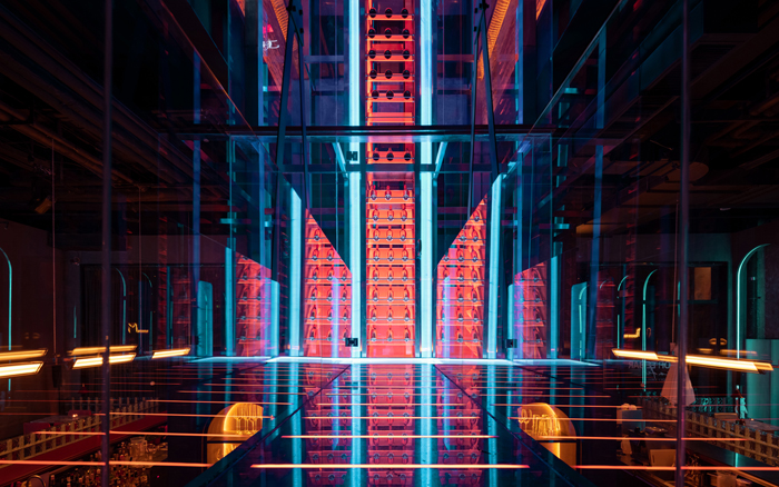
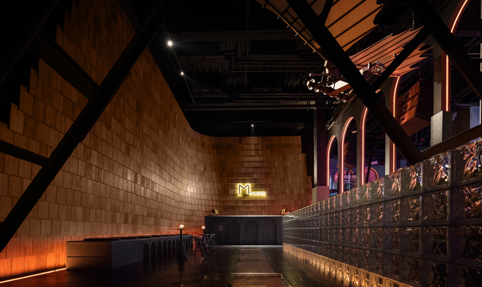
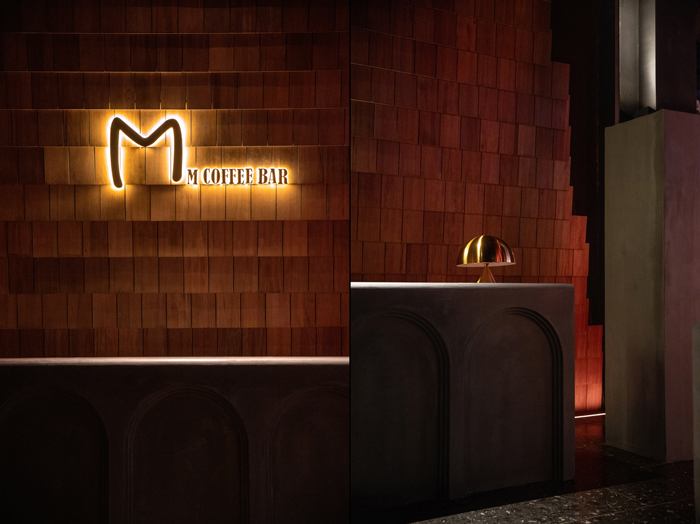
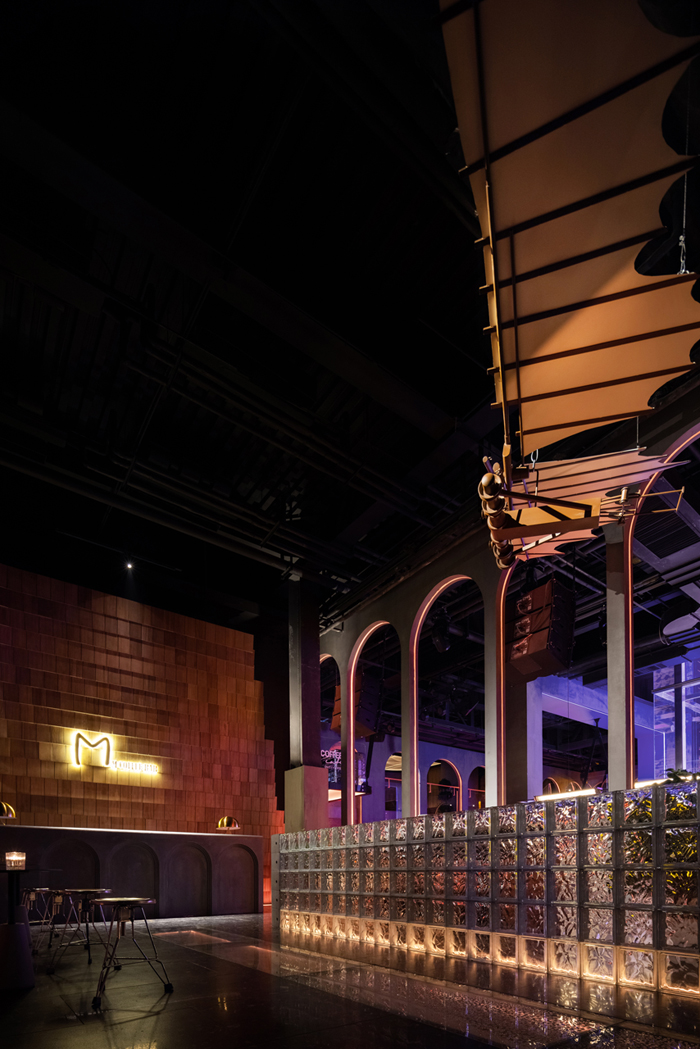
M Coffee Bar作为一个深受年轻群体喜爱的餐饮品牌,对每次调整都精益求精,希望能在延续品牌特色的同时带来些耳目一新的东西。而我们则致力于发掘场所的认同感、归属感,赋予“新东西”无限活力。M的新店从讨论到落成历时两年,一开幕即成为当地新地标,这也得益于品牌、场所、人的密切联系。

店铺位于哈尔滨西城红场,建筑前身为机械厂厂房,场所独有的“工业感”既是特征也成为桎梏。于是我们摒弃流于表面的“元素”,挖掘更加抽象的“隐喻”。
The store is located in Harbin Xicheng Red Square, the building was formerly a machinery factory, the unique "industrial" of the place is both a characteristic and a shackle. So we abandoned the superficial "elements" and explored a more abstract "metaphor".
广场、塔楼、白鸽,光看这些词脑中就能出现旧时城市公共空间的画面,而画面里洋溢的,自由、包容的氛围,正是M Coffee Bar一直想打造的。
The square, the tower, the dove, just looking at these words brings up images of old-time urban public space in your mind, and the free and inclusive atmosphere in the images is exactly what M Coffee Bar has always wanted to create.
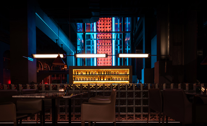
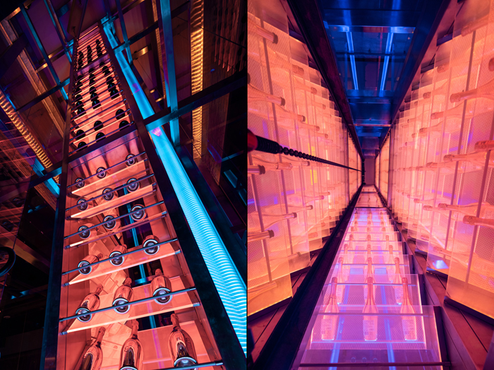
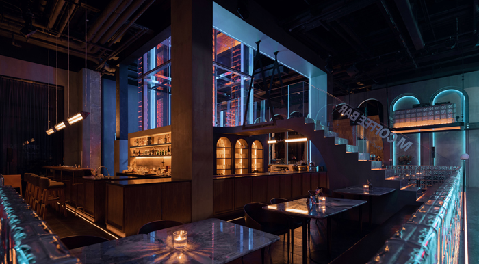
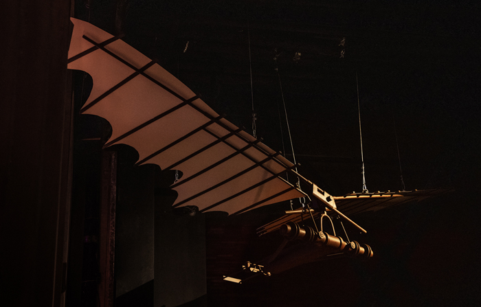
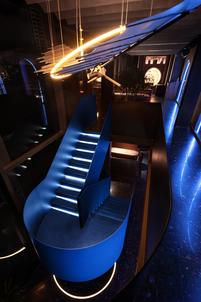
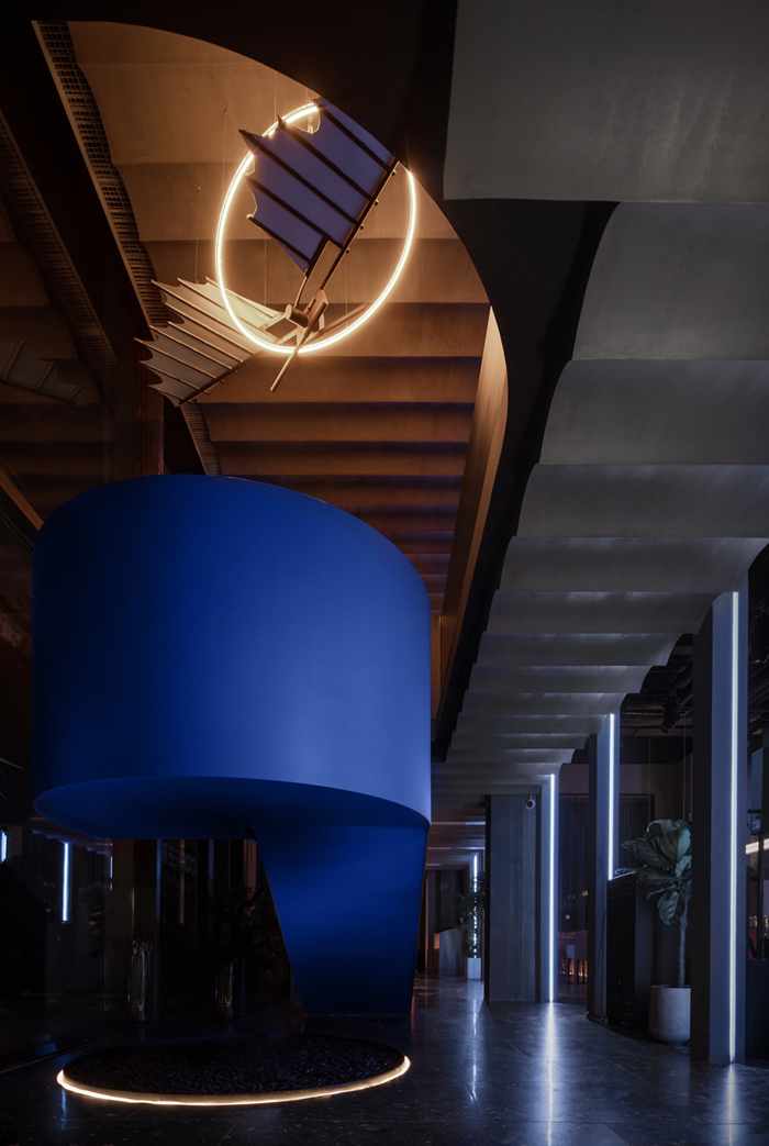
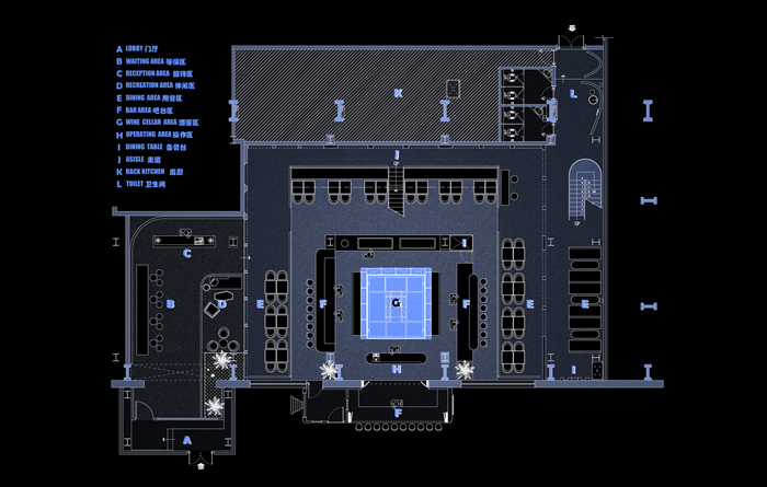
我们搭建了一座12米高的酒架,让它成为发光的“高塔”,并以它为核心用连续拱廊围合出矩形的用餐区;用鳞次栉比的砖墙与瓦片,模糊地面与屋顶,让复刻的达芬奇飞行装置成为“白鸽”。就此,M的“广场”初具雏形。
We built a 12-meter-high wine rack to become a glowing "tower" and used it as the core to enclose a rectangular dining area with a continuous arcade; we used brick walls and tiles to blur the floor and roof, and made a replica of Leonardo da Vinci's flying device into a "white dove". Thus, M's "square" emerged.
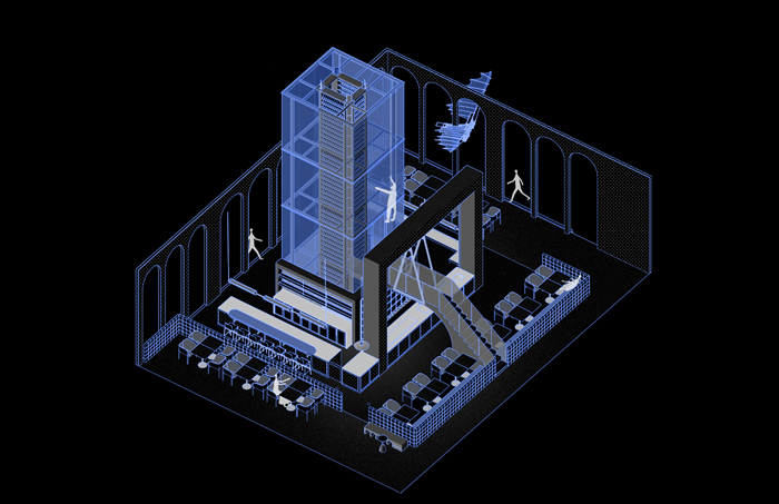
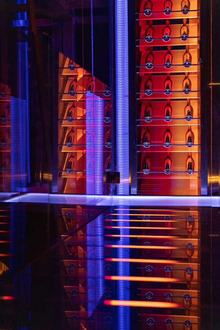
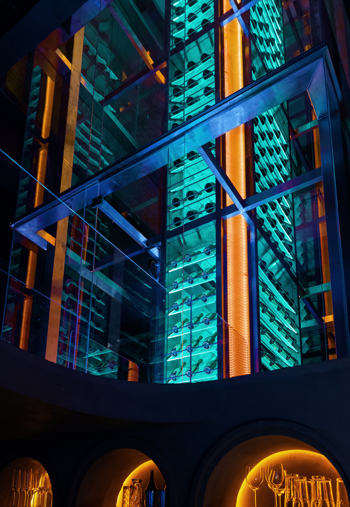
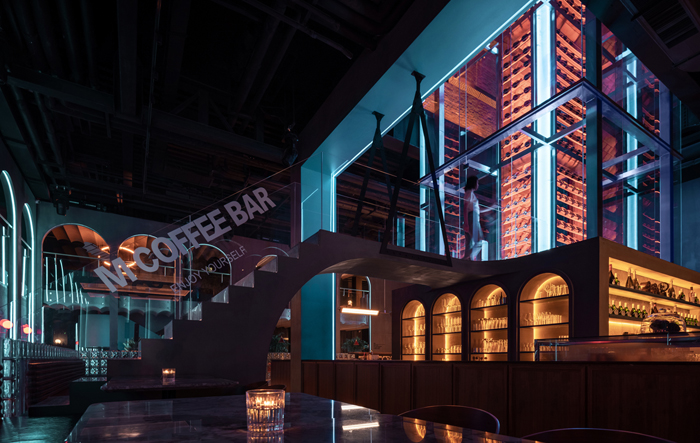
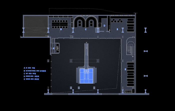
我们还引入一座阶梯,将高塔开放给所有人。独特的体验、深入其中的参与感,充满仪式感的取酒过程会让M的品牌深植于人们的记忆。
We are also building a staircase that will open the tower to all people. The vertical lift of the hanging from wire to pick up the wine will bring a deep sense of involvement and make the M brand deeply rooted in people's memories.
品牌与认同Brand and Identity
于品牌而言,周到的服务、经得起考验的产品、正向的互动,是与顾客建立联系的纽带,这一层面上M Coffee Bar已颇有造诣。在帮助品牌赢得更多的认同上,我们能做些什么?
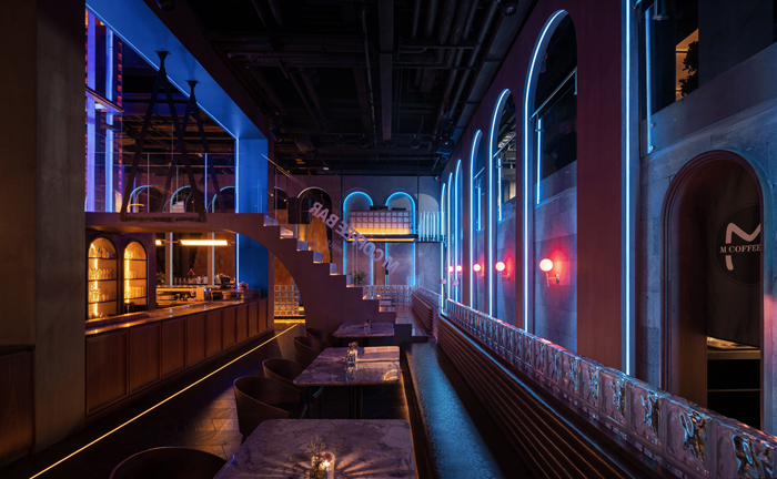
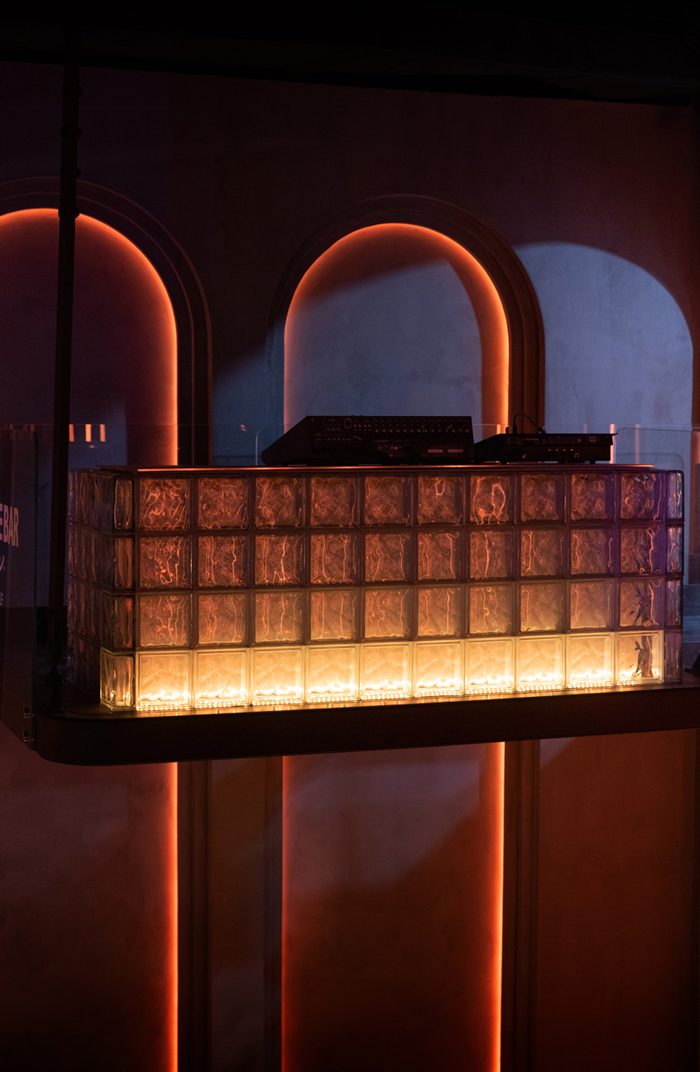
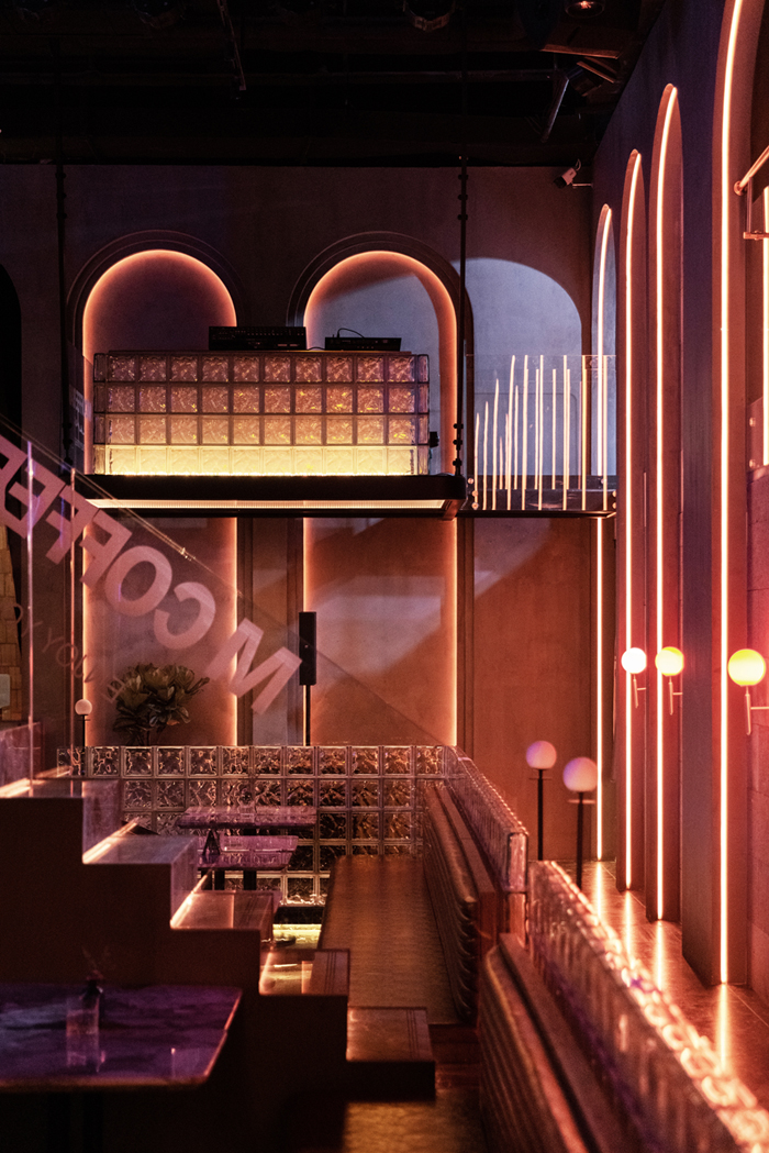
科学地规划人员动线及空间分区,提升服务效率;严谨地把控灯光、材质,优化细节体验。
Planning personnel movement lines to improve service efficiency; controlling lighting and materials to optimize detail experience.
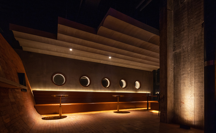
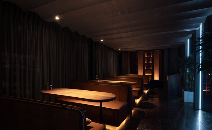
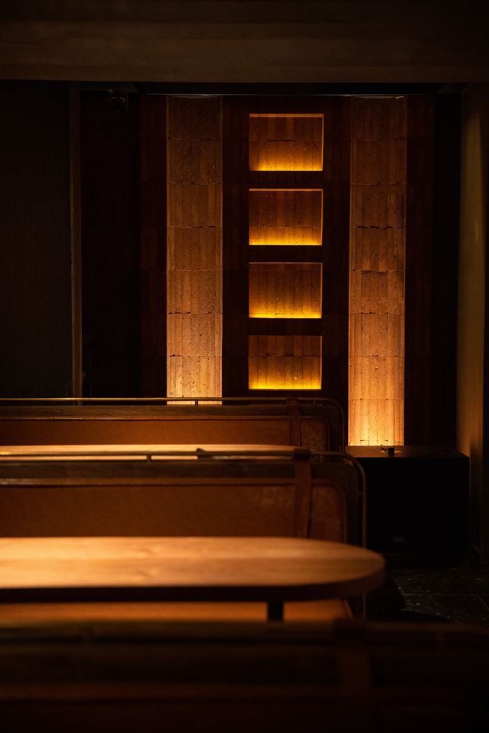
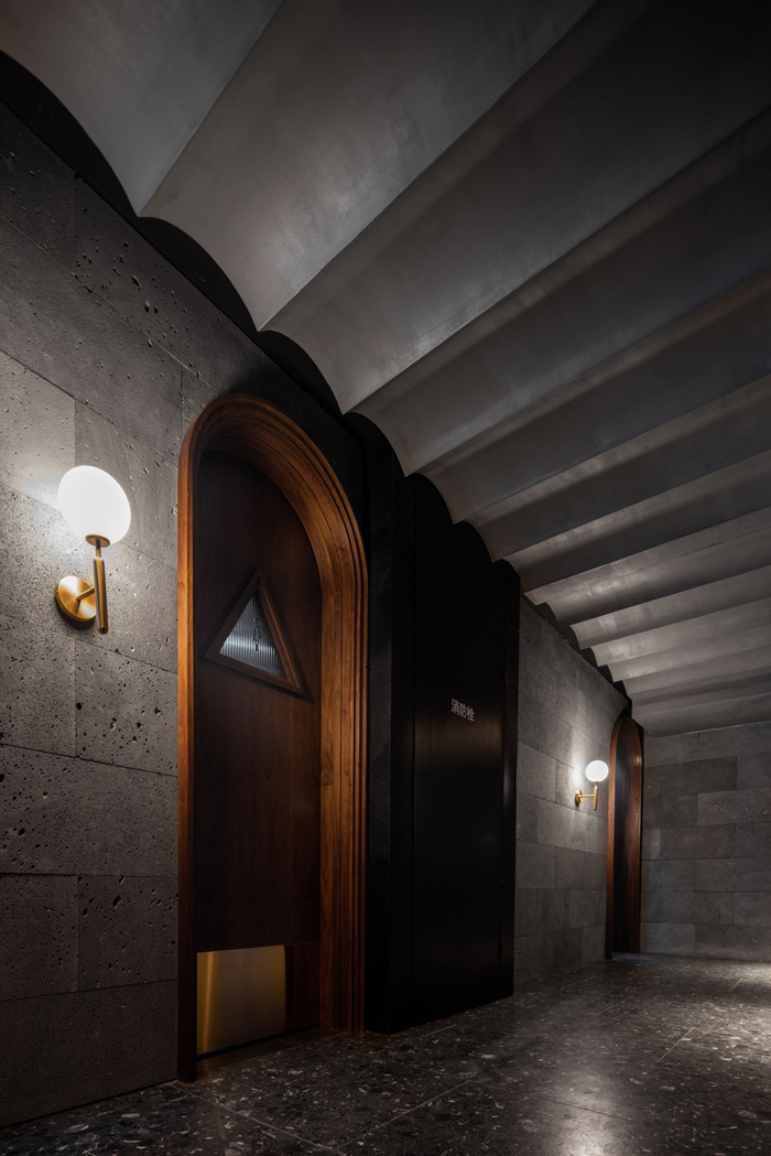
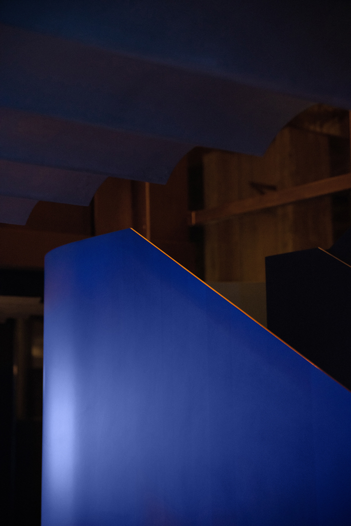
大块面现代、简洁,小块面(接触面)注重品质,塑造层次丰富的细节体验。
The large block is modern and regular, and the small block (contact surface) focuses on quality and detail experience.
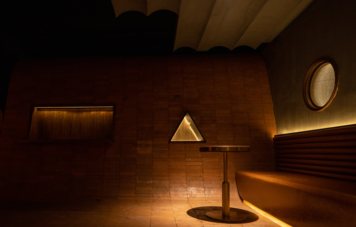
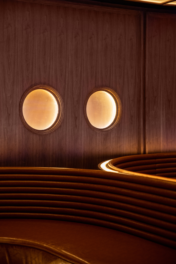
视觉的热闹永远只是表象,深度地契合品牌、场所、人,才是让空间迸发生命力的答案。
Visual buzz is always just the surface, a deep fit with the brand, the people and the genius loci is the answer to make the space exude vitality.
版权声明→本文由作者本人或用户及授权机构推荐发布到「游憩网」,仅代表作者观点,不代表「游憩网」立场。部分作品来源于网络,该作品仅供学习使用,非商用,如转载/链接/转贴或以其它方式使用本稿,需注明文章来源:「游憩网」及作品单位,相关疑问,请添加网站顶部投稿二维码。
在线留言