——游憩规划——
2021And move forward together
“绝大多数的事情,并非是你想清楚以后才感觉不在乎,而是你不在乎以后才突然想清楚”
作者:朴开十向设计事务所 发布时间:2022-07-25 浏览量: 次
去开凿和创造,一个质朴的十方空间
To Create To Initiate For Pure For Sheer
STEP ONE 一个U的Key Word
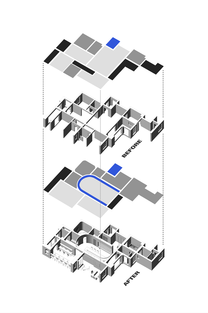
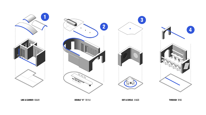
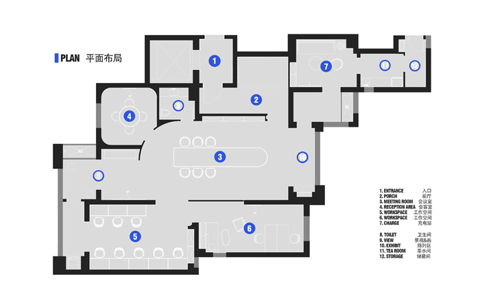
我们首先在整体空间中,拉出一个大U形,让所有流线围绕着这个U
Step one: U shape
First, we draw a big U in the center of the space, and had all the movement lines around this U.
STEP TWO建筑形体锤炼空间叙事
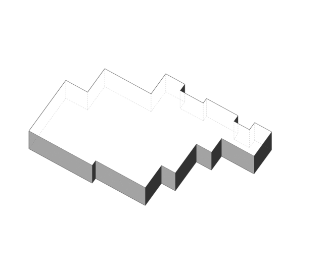
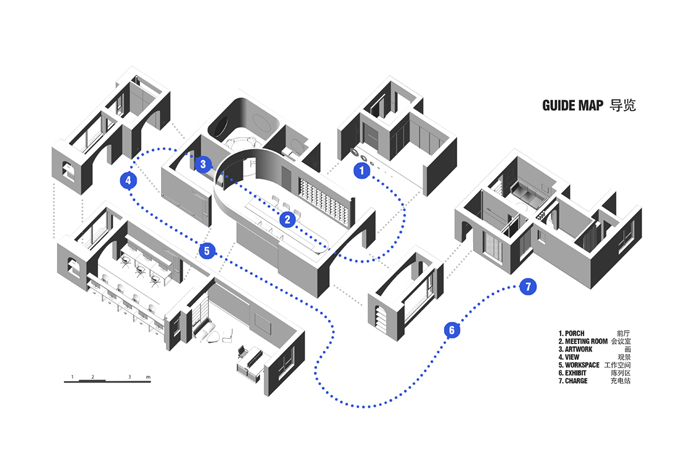
作为主秩序之外,在每一个独立空间中,我们都使用一种几何形体来建立这个空间的性格,再通过光影统一这个空间的情绪。
In addition to the main U shape, in each independent space, we use a geometric form to establish the character of this space, and then unify the mood of this space through light and shadow.
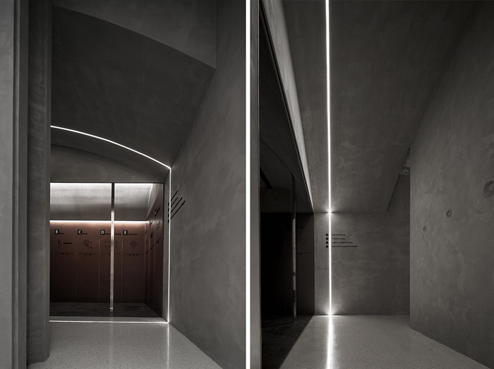
电梯入户的设置,让每一位到访者在电梯打开的一瞬间,在窄小的电梯间,就会建立对品牌的第一印象。因此我们在没有任何外部自然光线的电梯间及前厅使用了拱形和线性灯带形成视觉张力,并且通过一圈从天到地360°围合的灯带,形成一个完整拱切面去加固形体认知。纯粹的大面积灰色,褪去了颜色的外壳,剩下的是光与影的交织,把人迅速带入到这个空间所传递的品牌氛围中。
The setting of the elevator entrance allows each visitor to establish their first impression of our company brand in the narrow elevator room the moment the elevator opens. Therefore, we used arch and linear light strips to form visual tension in the elevator room and formed a complete arch section through a circle of light strips from the sky to the ground to reinforce the feeling. The shadow of the light and the large area of grey bring people quickly into the brand atmosphere conveyed by the entrance space.
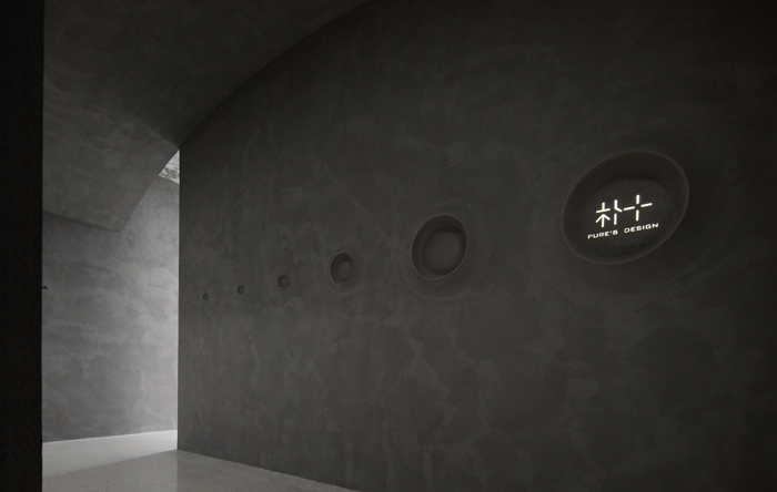
▲墙上的环形山的造型,增加了单纯中的趣味性,在水泥涂料营造的“质朴钝感”中,唯一精致的LOGO,直击人心。
The crater shapes on the all increased the interest in simplicity style. The cement paint conveyed the feeling of desensitization, thus the delicate designed LOGO can directly powerfully strike into one’s heart.
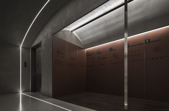
像每一个博物馆和美术馆在进入之前,都会有一个介绍的“序言”一样,在这个形象导入区域,我们也设置了一个朴开十向的“序言”,但不是品牌的历程或组织介绍。而是用一些符号化的语言,把整个办公室的设计手法和空间手法展示出来。我们坚信,作为设计师,作品就是我们最好的品牌代言。
Just like every museum and art gallery will have an introduction "preface" before entering, we also set up a simple "preface" in this image introduction area, but it is not an introduction of brand history or organization. But with some symbolic language, we present the entire office design techniques. We firmly believe that, as designers, the project speaks louder.
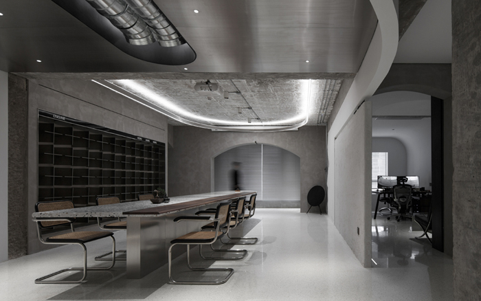
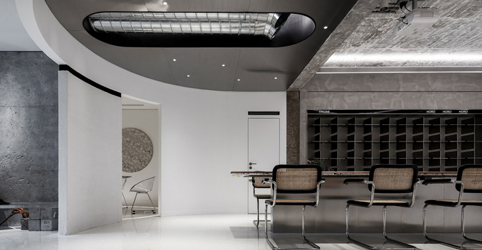
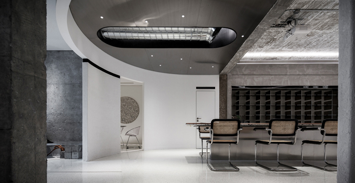
综合空间,是人流的聚集,也是视觉的聚集,因此需要有一个空间边界的限定。但作为空间的枢纽,它与其他区域又需要是融合的。我们采用了吊顶U+灯带U的”双向U”形成如胶囊形状的空间限定。5米长的桌子,配合外拓的弧形边界,让视线往前拉伸,增加了空间的张力与力量感,同时可以满足20人举行会议和沙龙,承载了多种功能需求。而长桌也是一个U形,在整个空间中,把U不断重复强调,再在最小的U的半圆圆形,用一个顶柱石形成空间形态的画龙点睛。
Mixed-used space gathers people and vision. It need boundary, but on the other hand, it also need to be connected with other spaces. We used U shaped ceiling and U shaped strip lights to created a breakable boundary. The 5-meter-long table, with the curved boundary of external extension, makes the line of sight stretch forward, increasing the tension and sense of strength of the space, and can meet 20 people to hold meetings and salons, carrying a variety of functional needs. And long table also is a U shape,. In whole space, U shape is repeatedly used.
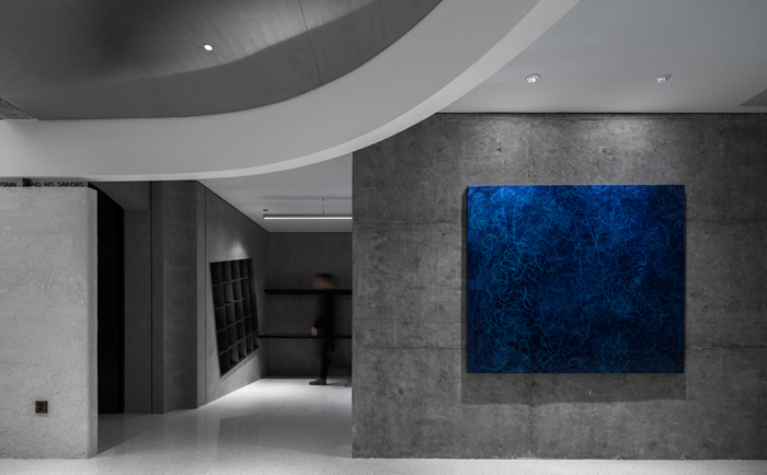
在U形的延伸尾端,是一个有些“多余”的空间。如果把这个空间也纳入U形范围,过于狭长的比例会影响美感。而如果在这个空间设置为其他功能空间,则又会破坏U所构筑的氛围整体性。我们索性将这个区域的功能性“浪费掉”,做了一个“看画角”,挂上一副由湖北青年艺术家赵胤杰创作,曾在湖北省美术馆展出的油画作品《弥合》。浓郁的深海蓝,是整个空间里唯一的一抹“有色调”的颜色,也是艺术的灵感缪斯。
At the end of the U shape extension is a somewhat “redundant ” space. If it is included in the range of U shape area, the thin and narrow space will affect the aesthetic feeling. If it is designed to be other functional space, the whole construction of U will be influenced. We simply "wasted" the functionality of this area, made a "viewing corner", and hung a painting "bridging"which was once exhibited in hubei art museum created by Zhao Yinjie, a young artist from Hubei province. The deep blue is the only "tonal" color in the whole space, and it is also the Muse of art.
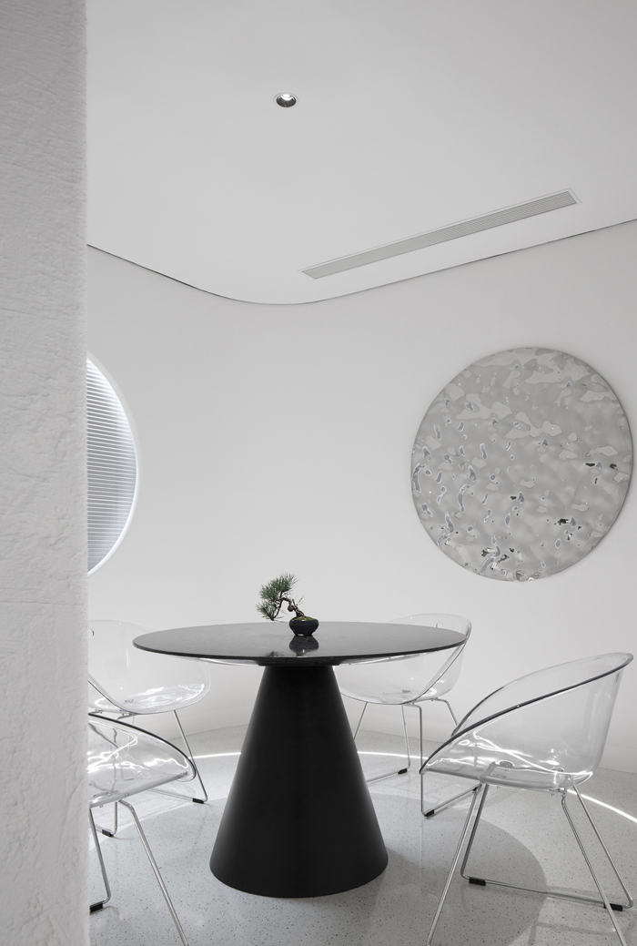
在茶室,目之所及,都是圆,内凹的弧形墙,地面环形灯带,圆桌,圆窗,圆形的墙面装饰,清透的白色,与灯带散射的泛光照明,形成一个没有边界的对称空间。墙面的水波纹不锈钢,根据人的动态产生不同的折射光影,又像静谧水面中荡漾开的涟漪。
“须知一盏花前酒,占得韶光,莫话匆忙,梦里浮生足断肠。”
In the tea room, every corner is round. The wall is curved. The light belt on the ground is circular. The table, the window and the decorations on the wall are round. The color of this space is light and shining, mainly white. The tea room is designed in a asymmetric way. It looks delicate and elegant.
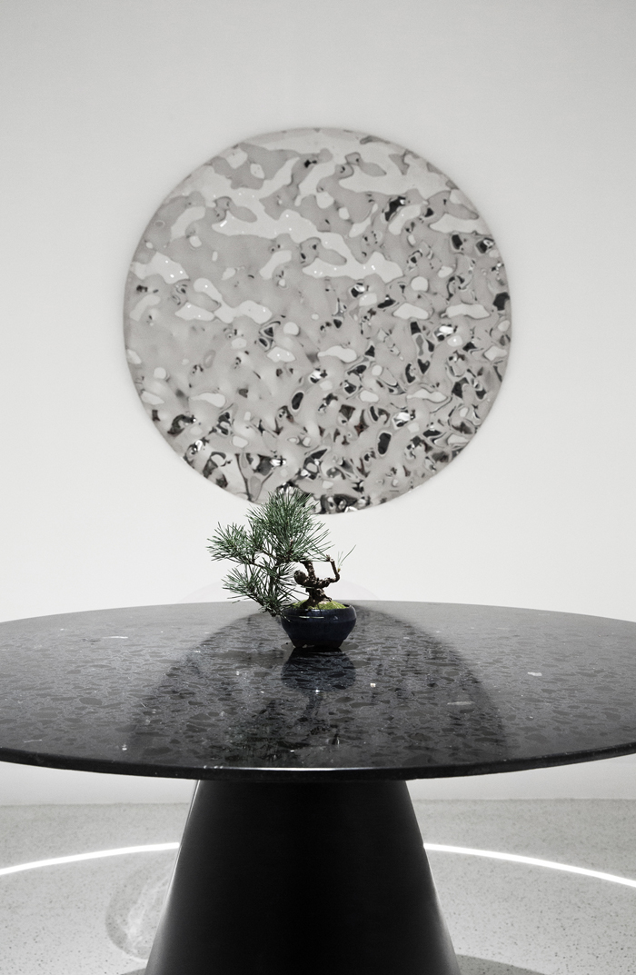
圆所代表的生命哲理与精神原型,让驻足在这个空间的时光都染上了几分禅意。
The life philosophy and spiritual prototype represented by the circle make the time standing in this space be infected with a bit of Zen.
阳光最充沛的南向空间,设置为大家的公共办公区域。这个轴线是大厅轴线的偏移,地面嵌入一根直线铜条,与天花板的直线灯条相互呼应强化空间轴线,将空间引向窗边。
The public office area is set at the southern part where the sunshine is the best. The floor is embedded with a straight copper strip echoes to the straight light on the ceiling to strengthen the spatial axis, leading the space to the window edge.
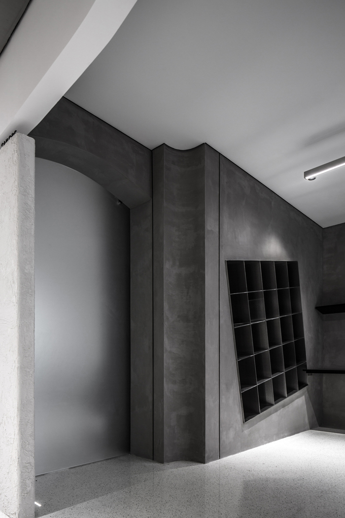
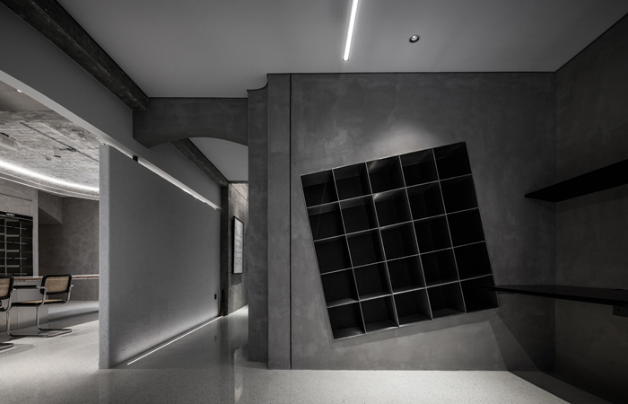
矩形材料架嵌入了墙体,特意的倾斜,增加了趣味性与灵动性,也刺激大家的创造力。
Rectangular material frame is embedded in the wall,deliberately tilted, which added interest to the space and can stimulate creativity.
l 冲突是一种美学,也是一种态度 Conflict is both an aesthetic and an attitude
“没有时间,时间只是意识的错觉。意识缔造了东南西北,生死未来。当意识成为时间,上天、下地、东、西、南、北、生门、死位、过去、未来,这十大方向便成为一个可被缔结的空间。
——独立艺术家 · 林万山”
Time is an illusion of consciousness,creating everything.
朴开十向,是一支年轻的团队。全90后阵容,成立不到5年。我们追求质朴,却拒绝平淡;偏好现代主义,也崇敬古典语汇。冲突与融合,是我们的日常。
Pures design is a young team. Our company is no more than 5 years old and all the members of our team are post-90s. we pursue the pure while reject the plain, and we prefer the modernism while respect the classical.
为了完善空间的完整性,我们将原始阳台合并到了空间整体中,将阳台的剪力墙顶面做成了石器的“拱券”,却又把券心石去掉,隐喻了古典的手法用一种现代的形式呈现。
In order to improve the integrity of the space, we incorporated the original balcony into the overall space, and made the top of the shear wall of the balcony into the stone "arch". But the core of the stone was removed, which is a metaphor of the classical technique with a modern form.
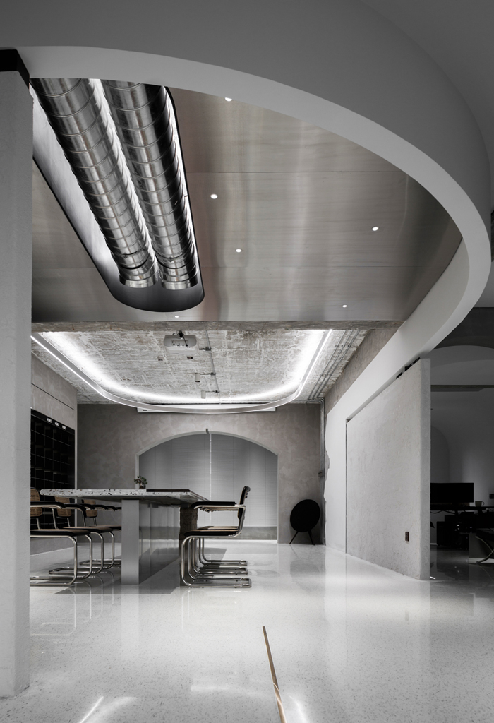
视觉焦点“双向U”的顶部材质,一半是极具科技感的拉丝不锈钢,一半是最基础的原始顶。强大的材质反差,增加了形态聚焦之外的视觉张力。而空调的出风口设置为螺旋风管造型,更让这份张力,在机械感美学的动力加持之下,喷薄而出。仿佛一艘飞船的发动机,驱动着朴开十向的创意前进。
As for the material that we chose for the U shape attached to the ceiling, half is stainless steel with a strong sense of technology and half is the rough roof. Strong material contrast adds to visual tension. And the air outlet of the air conditioning is set as spiral wind tube, strengthening the visual tension. With the mechanical aesthetics, it looks as if it were the engine room of a spaceship, driving Pure’s Design to the future.
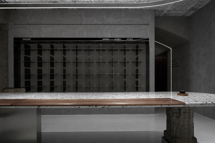
地面与桌面统一采用了具有古典质朴感的水磨石,用胡桃木局部点缀调节,在石材的冰冷坚硬中融合一丝温度感。而桌子的支撑部分采用不锈钢,现代科技属性的材料,与胡桃木、水磨石、及清代的顶柱石形成冲突对比。不锈钢撑着清代顶柱石,是古代和现代的交汇。
The ground and desktop is adopted the classical feeling terrozzo stone. Embellished with walnut wood, the cold stone can also have the warm feeling. The table legs are made of stainless steel. Stainless steel supports the Qing Dynasty pillar, which is the integration of ancient and modern.
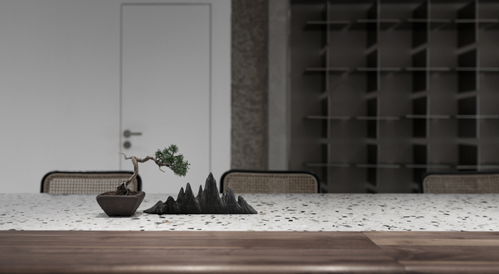
综合空间的书架采用不锈钢定制,嵌入墙体当中,以朴十的LOGO形状作为分隔,仿佛LOGO破墙而出,是品牌符号的强化。
The shelf is made of stainless steel and and is embedded in the wall. The shape of company’s LOGO is used as separation of the shelf.
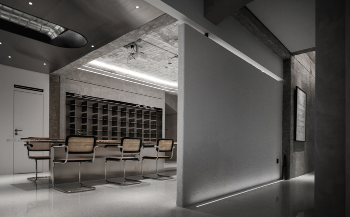
整体空间配色,大面积采用还原材质质朴之感的“黑白灰”,而墙面的材质也保留了最能体现建筑形体感的原式混凝土墙体和肌理涂料。在重构空间的同时,也尊重原始的结构,新加的墙以肌理涂料,与原式的墙形成材质的区分。
The color mainly used are black, grey and white. We kept the rough feeling of the concrete wall. While doing the space reconstruction, we fully respect the original structure of the building and add some creative art elements to the space.
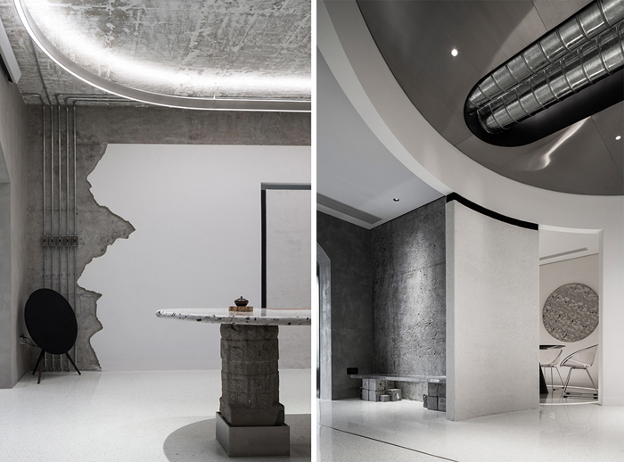
所有线管都使用明装的KBG线管,全都露在表面。除了呼应空间“机械感美学”之外,也在以纯净空间里的点线面,丰富视觉上的细节。线管旁的墙体“装饰”,其实是把原始的墙皮凿掉,漏出混凝土墙体,施工师父随手凿就的形状,颇具艺术感。
All the wire pipes are equipped with light KBG wire pipes, which are all exposed to the surface. In addition to the echo of "mechanical sense of aesthetics", also it can make the vision rich and detailed. The wall "decoration" beside the line pipe is actually to chisel off the original wall skin and leak out the concrete wall.
“看画角”供大家坐着赏画的长凳,用最基础的建筑材料,混凝土的立方体堆砌成“凳腿”,一块亚克力的透明板子作为“凳身”,精致与粗糙形成的冲突对比,让这个艺术空间更具有艺术的戏剧性。
Viewing Corner has a bench for appreciating the painting. The material used as chair legs is the most basic construction material, concrete, while the body of the chair is the transparent acrylic. The space feels more dramatic with art when it has the contrast between delicate and rough.
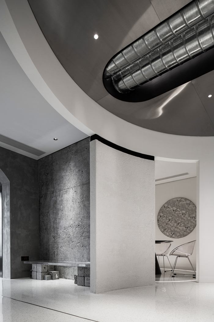
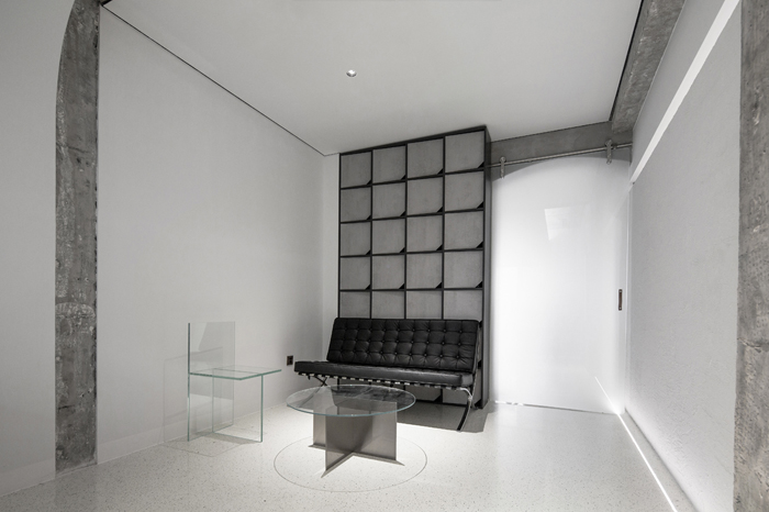
在自己的“私属创作空间”中,我们将顶面与墙面连成一个曲面,形成一个包裹的氛围感,从顶上倾泻而下的“灵感之光”,墙面上挂着的从萨伏伊别墅带回的柯布西耶的设计作品集合,一切都是我们喜欢和舒适的样子。
In our own "private creation space", we connect the ceiling and the wall into a curved surface, forming a sense of enveloping atmosphere. The "light of inspiration" pours down from the top, and the collection of le corbusier's design works from villa savoy hang on the wall. It looks perfect and it feels comfortable.
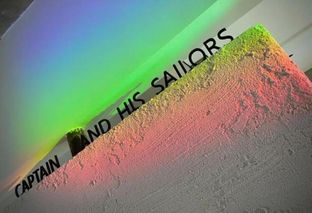
过年放假的前一天,阴雨绵绵的武汉,在那天放晴了。阳光透过窗台摆设的三棱镜,折射出一道彩虹,落在了“船长和他的水手”上。感恩这条开凿与创造之路上,陪伴我们一起走过的你们。在未知的未来,我们有星辰和大海。
The day before spring festival was a long-lost sunny day in Wuhan. A rainbow appeared on “Captain and his crew”. Thank everyone for accompanying. Looking forward to developing a magnificent future together.
版权声明→本文由作者本人或用户及授权机构推荐发布到「游憩网」,仅代表作者观点,不代表「游憩网」立场。部分作品来源于网络,该作品仅供学习使用,非商用,如转载/链接/转贴或以其它方式使用本稿,需注明文章来源:「游憩网」及作品单位,相关疑问,请添加网站顶部投稿二维码。
在线留言