——游憩规划——
2021And move forward together
“绝大多数的事情,并非是你想清楚以后才感觉不在乎,而是你不在乎以后才突然想清楚”
作者:STUDIO DOHO 发布时间:2022-06-28 浏览量: 次
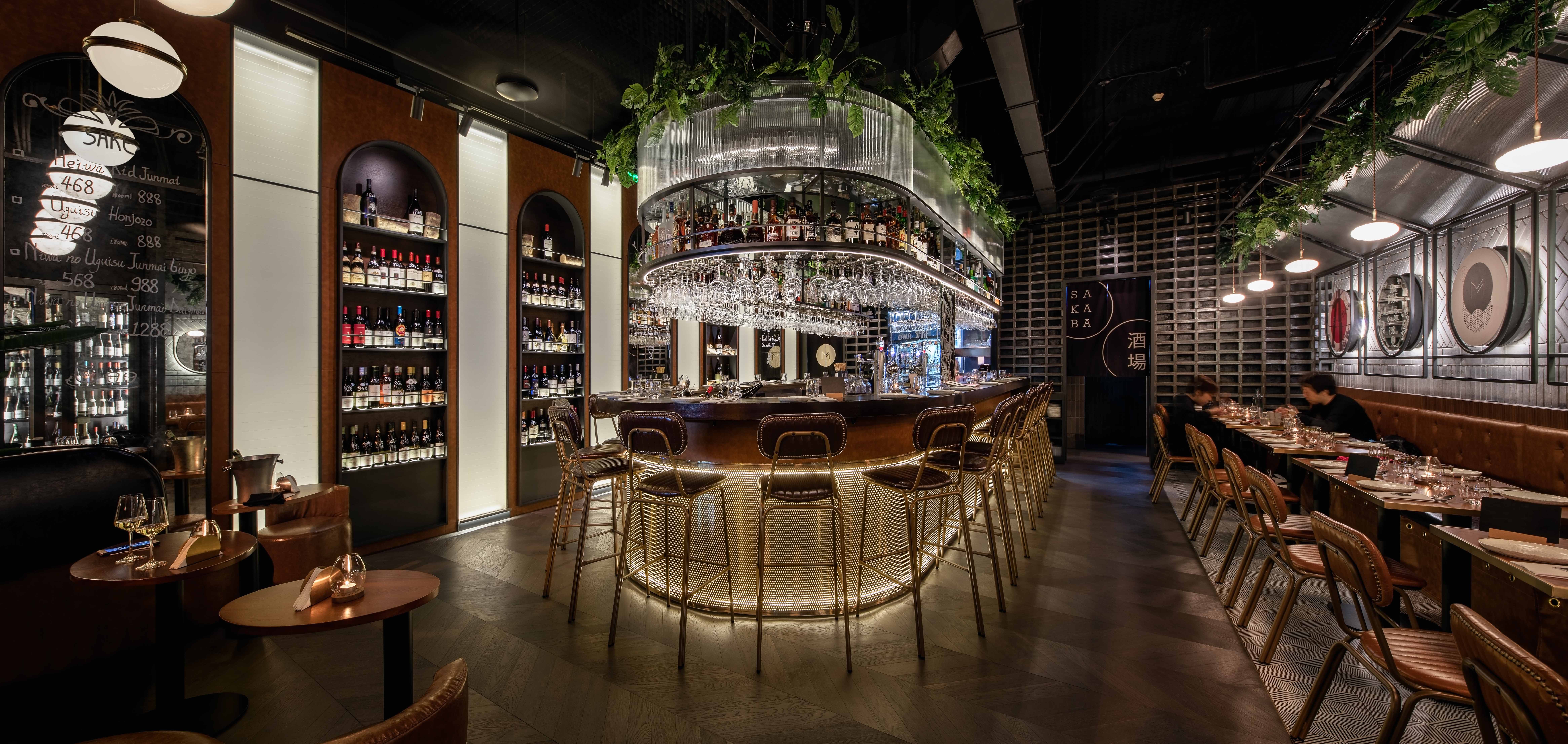
STUDIO DOHO受上海Malabar委托,对餐厅进行了全新的室内设计改造。已经营多年的Malabar希望借此改造契机提升其品牌形象,升级为更加精致、成熟的西班牙日式融合餐厅。
STUDIO DOHO was commissioned to design the new Malabar in Shanghai. The existing bar wanted to reinvent itself as a premium, upscale eatery that focuses on a fusion of Spanish and Japanese cuisine.
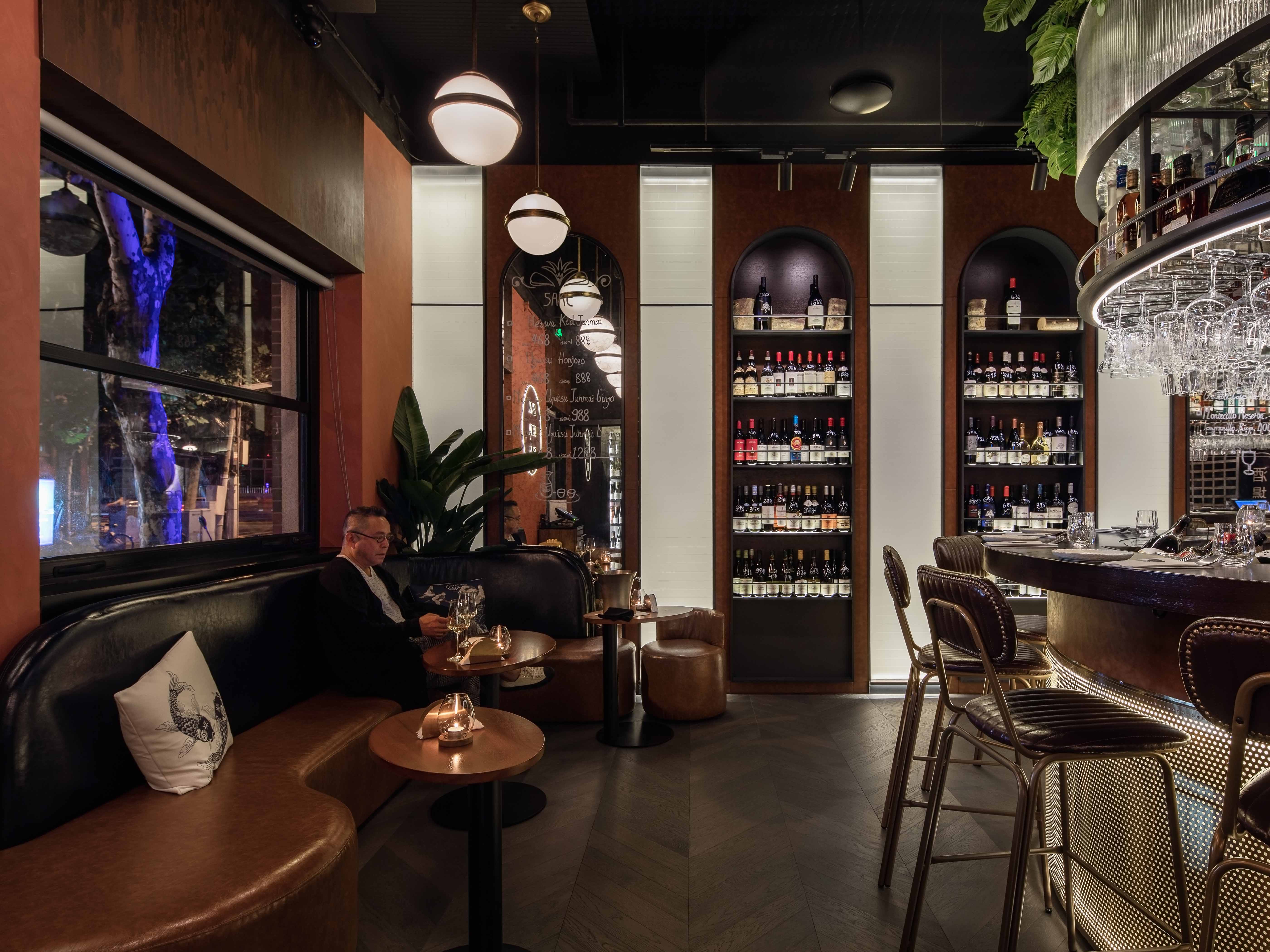
"我们希望以当代手法重塑融合派设计,灵感源自老石库门融合派建筑及日式和风繁复朴素的精致图案,同时以西班牙风情的温暖色彩点缀其中。" STUDIO DOHO的主创设计师Xin和Jason谈到。
'We wanted to keep it a contemporary modern venue with only a subtle reference to Japanese elements. Inspiration comes from the history of the brand and the austere repetitiveness of Japanese patterns, coupled with the warmth and welcoming feeling of Spanish culture,' said Xin and Jason from STUDIO DOHO.
Project Background
项目背景
Sakaba Malabar位于上海静安区武定路老石库门建筑沿街,这里也是上海著名的西餐酒吧一条街。它的前身Malabar作为远近闻名的西班牙街头风味酒吧,已经在此经营了9年。主理人希望进行一次彻底的翻新,以提升整体的品质感,打造精致、时髦、又不失亲民的氛围。
Sakaba Malabar is located on the street front of an old Shanghai Shikumen inspired facade on Wuding Road, where a few famous western bars and restaurants have settled for years. The old Malabar, a well-known Spanish street-style restaurant and bar, had been in business for 9 years before deciding to change the concept to more mature version of its previous self. The owner decided to carry out a thorough renovation to create a new, unique concept for the restaurant, that is cool and sophisticated, but still offers a welcoming feeling.
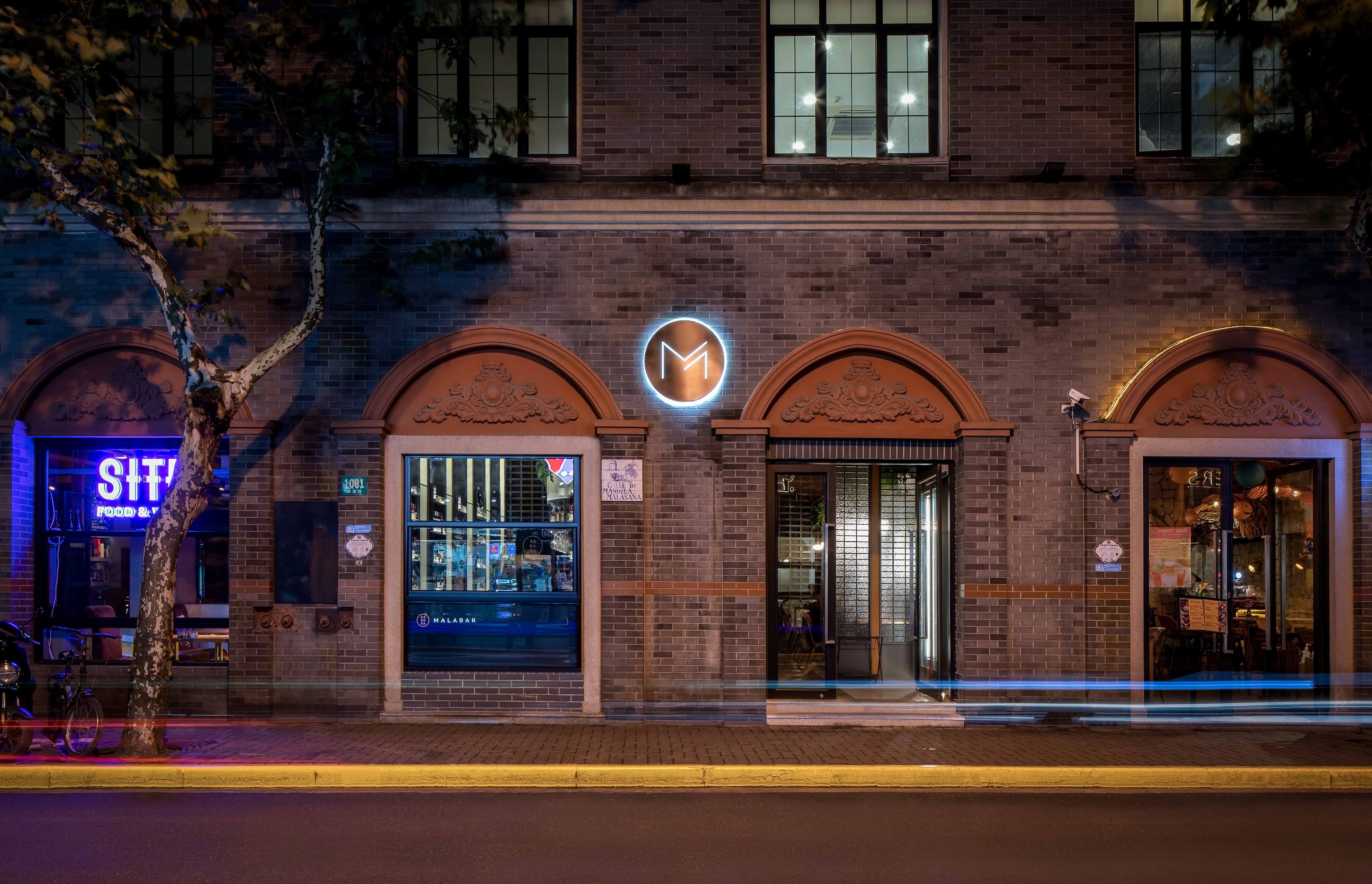 改造前的空间是典型的bistro街头风格,空间被分散的桌椅占据,吧台位居一侧,整个空间更强调饮品而不是室内设计,呈现一种非常随意的氛围。The previous space was a typical bistro street style. Scattered tables and chairs occupy the dining area with a bar located on the side, a very casual vibe that placed more emphasis on the drinks rather than the interior design.
“原本空间的中央有一个立柱,使空间显得很局促而不灵活,也促使我们重新考量和设计整体的结构和布局;要将所有功能安排在狭小的空间内很有挑战性,但我们和业主紧密地沟通,尽可能最大化地利用每一寸角落,” 主创设计师Xin这样讲到。
'The existing space had a central column, which dictated the layout of the re-design. It was difficult to fit the full program in the small space, but we worked closely with the owners to optimize every centimeter,' explained Xin.
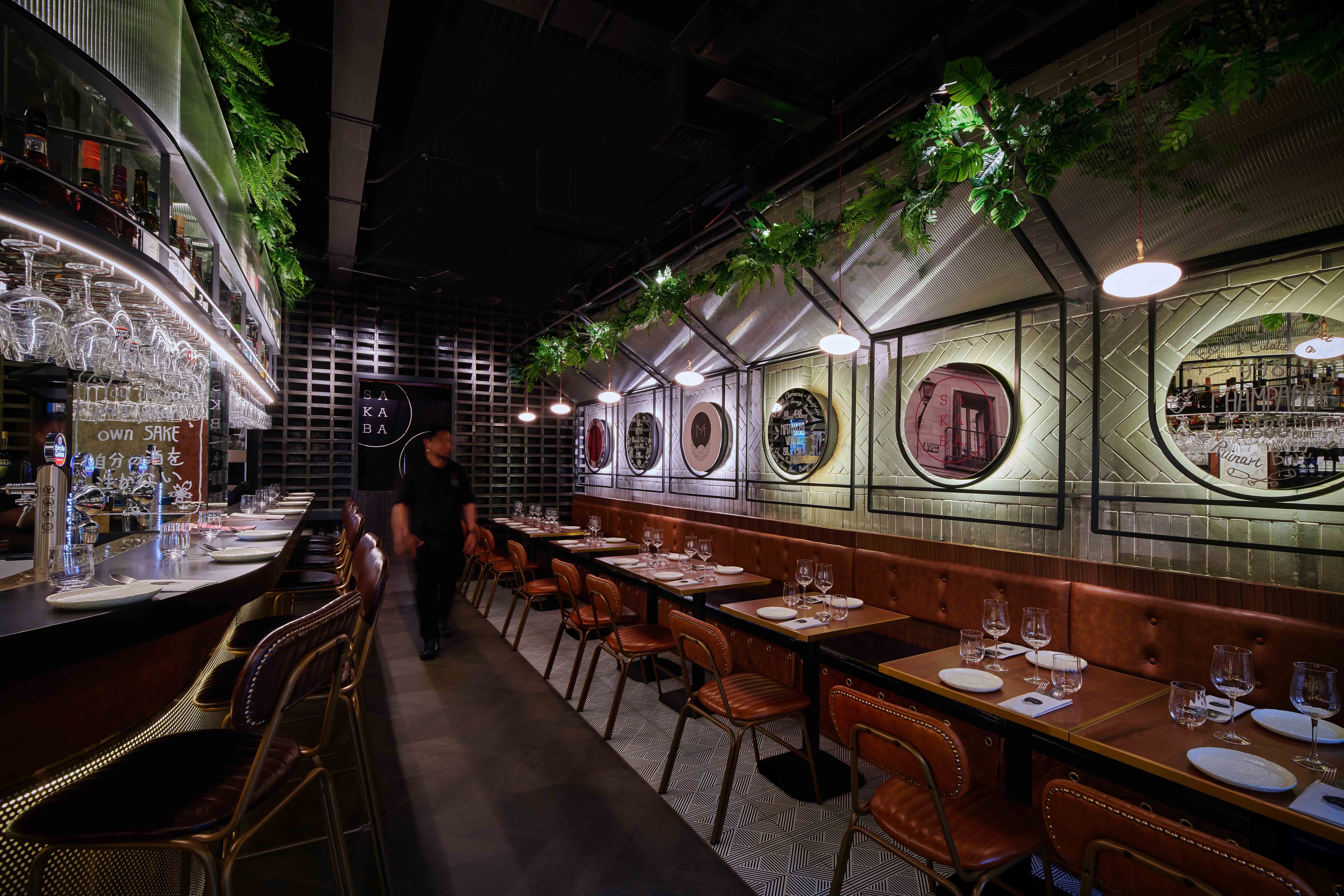
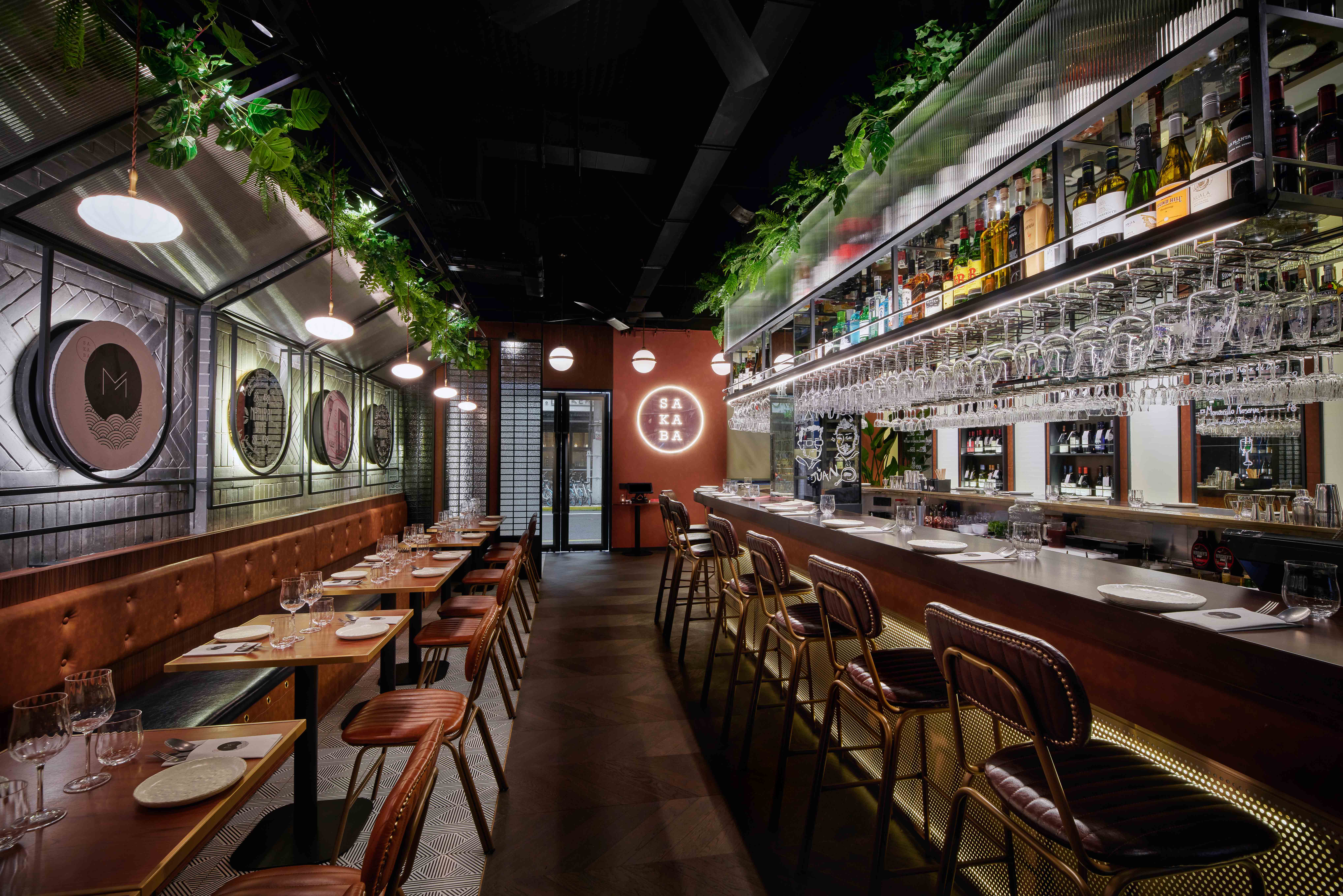
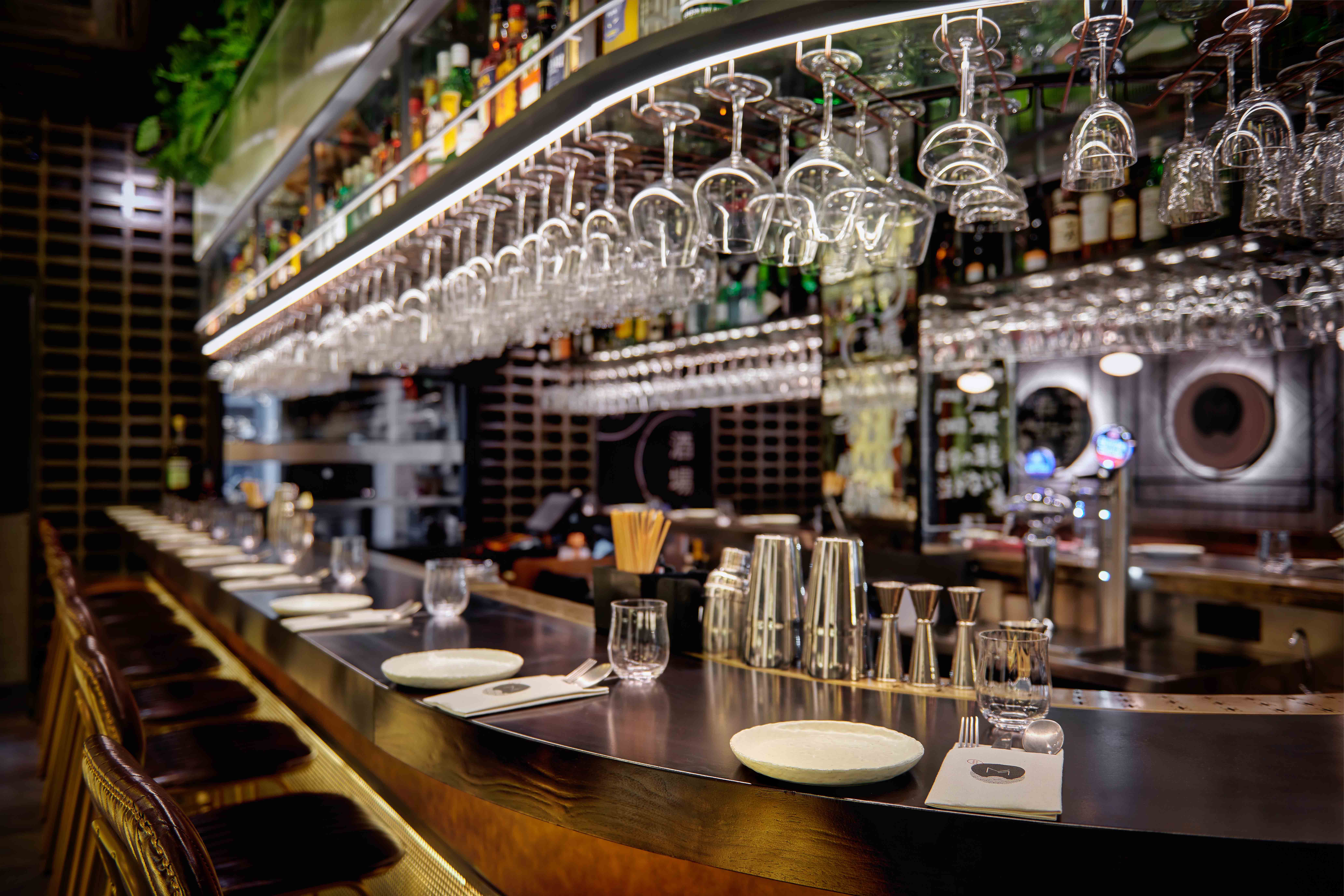
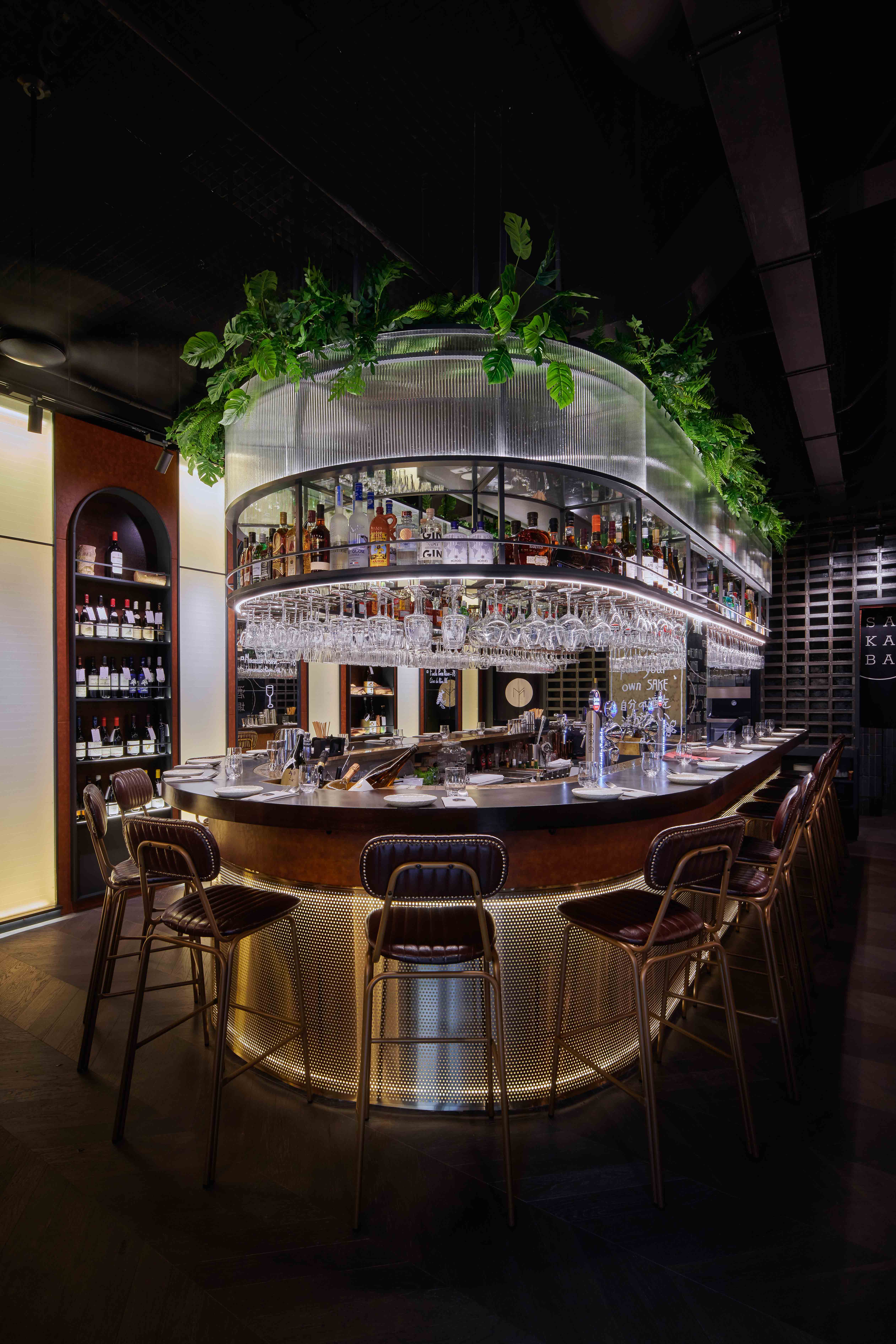
改造后,一个U型吧台占据中央,成为主要的社交中心和视觉焦点。灵感源自日式tepanyaki式的社交用餐,可容纳20人的吧台给予客人与调酒师直接交流的亲密氛围。相邻一侧卡座区,则提供稍显私密的用餐环境,靠背以复古皮面包裹,带来放松及舒适感。餐厅入口还设有沙发区,供夜间小酌的客人围坐聊天。
To adopt a completely new spatial arrangement, DOHO inserted a U-shaped bar occupying the center and becomes the main social spot and visual focus. The bar accommodates 20 people and gives guests an intimate atmosphere, providing a fun interplay between diners, servers, and the kitchen. The adjacent side accommodates another 20 diners, offering a slightly more private dining environment. The backrest is wrapped in vintage leather to bring a feeling of relaxation and comfort. On the side of the entrance, a small lounge area is also set up for late-night guests have a cozy place to drink and chat.
Sophisticated Material Palette
巧妙的颜色和材质搭配
尽管餐厅自身带有鲜明的地域文化特色,我们选择以比较中性和当代的材料来塑造全新的基调,比如穿孔金属、复古皮质、玻璃及镜面等,而带着文化辨识的图案及元素则点缀其中。
Despite the strong cultural identity and story of the restaurant, the overall material palette is deliberately more neutral with the contemporary materials such as perforated metal, aged leather, vintage mirror, and glass. The cultural character only plays subtly in the whole design.
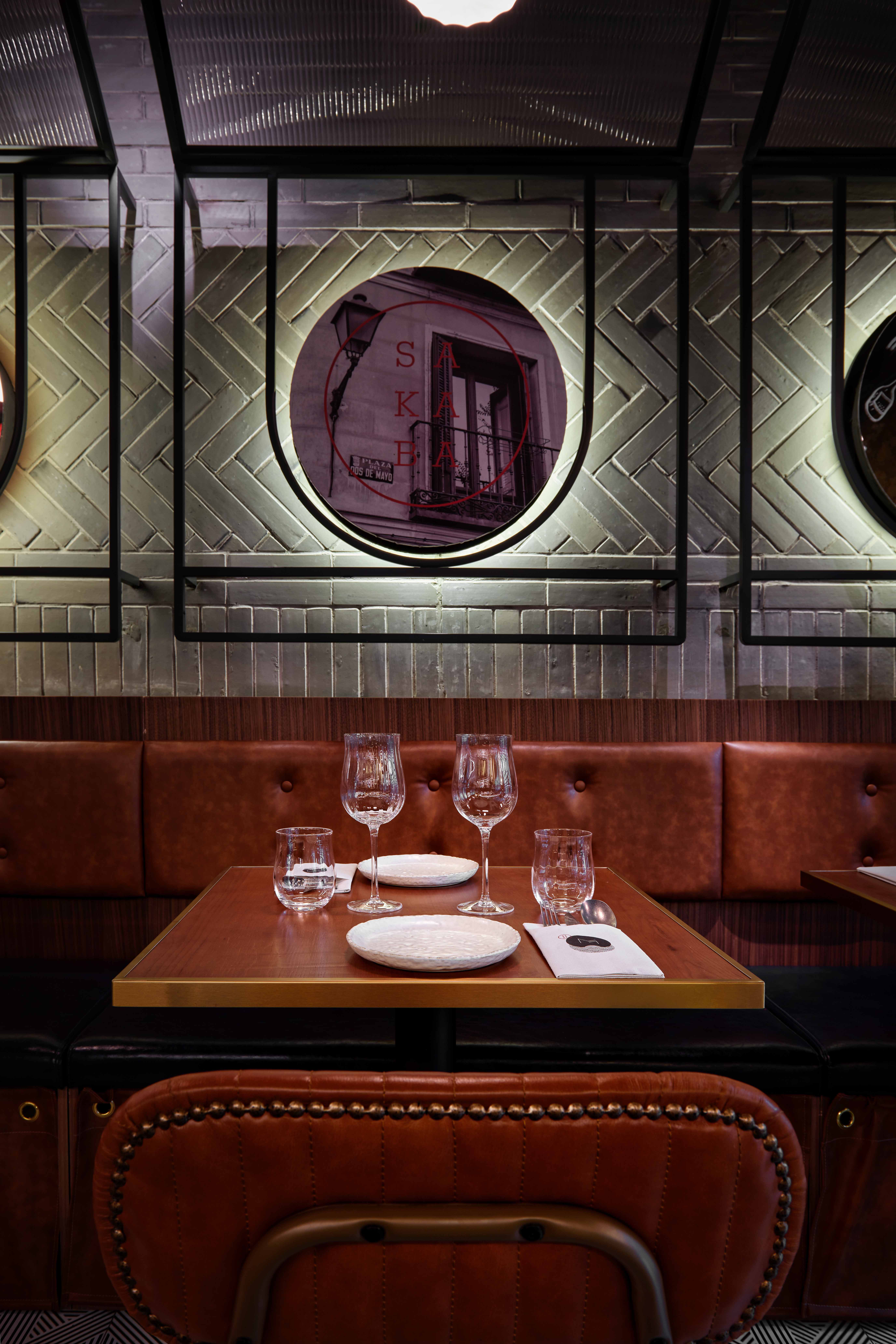
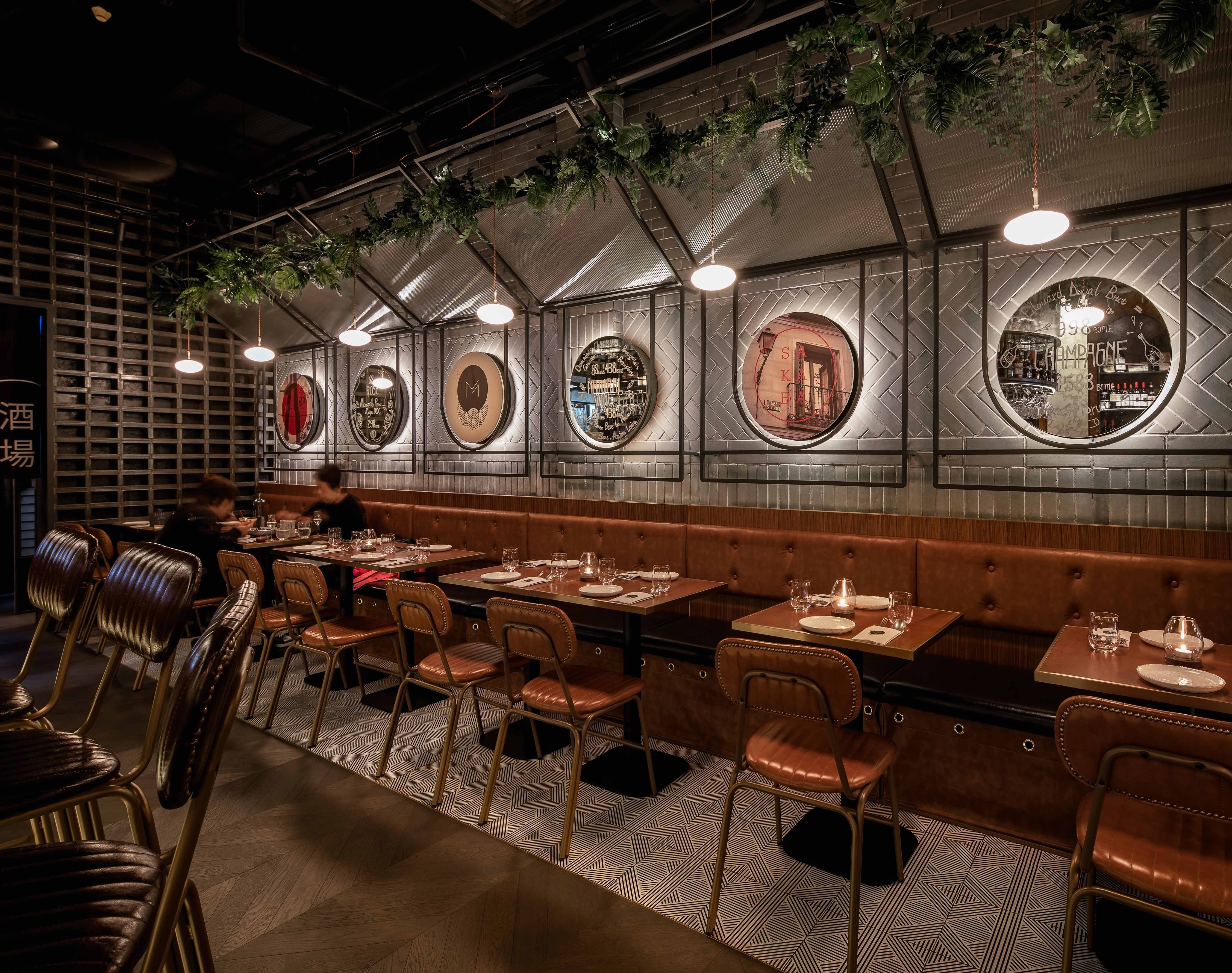
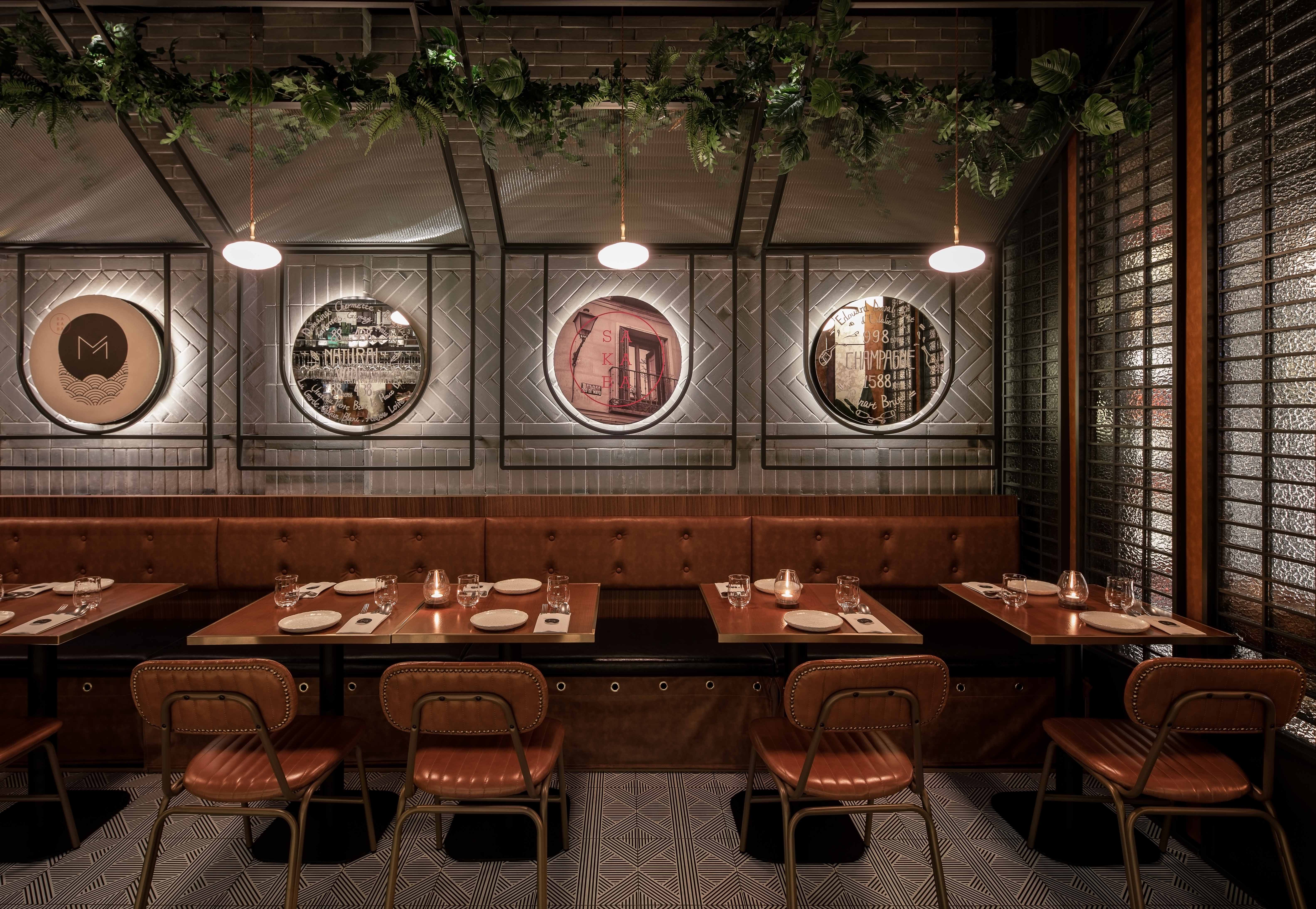
卡座区背墙的主基调采用灰砖,与老石库门建筑底色相呼应。而在后方的镂空灰砖墙,则是借鉴了日式室内设计的隔断手法,丰富了空间视觉的层次感。
Grey bricks on the sidewall of the space creates a neutral backdrop which is overlayed with textures, patterns and graphics. The hollow partition wall is also made of bricks at the back serves as a dark feature and backdrop to the space; the pattern is a reference to traditional Japanese interior dividers.
墙面和吧台材质都大面积使用了镜面及玻璃,增添了明亮度,让整体空间有了视觉的延伸感。镜面上点缀的涂鸦元素也是继承了老店的特色和趣味。
Mirrors and glass were largely used to make the restaurant feel brighter and more spacious as well as suitable but also serve as a writing surface to promote wine and sake specials, as well as fun messages---a wink to the spirit and vibe of the original Malabar.
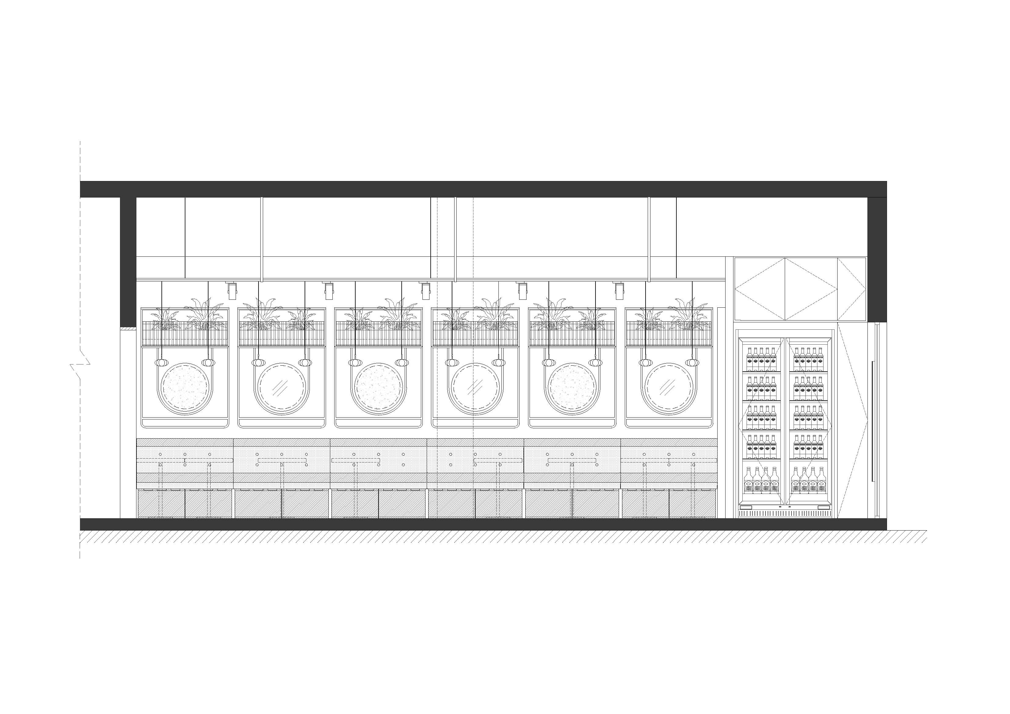
▲卡座墙立面图
Jason进一步提到,“质感是这个设计项目中一个很关键的考量。灰砖等坚固材料为轻盈通透的玻璃、镜面及复古皮革创造了恰到好处的背景基调,在厚重和轻盈、深沉和明亮之间达到平衡,创造出微妙的精致感。”
Jason elaborated that 'materiality was a key consideration in the project. This mix of strong materials such as black brick creates a canvas for lighter materials, including leather and glass, to create a level of sophistication.'
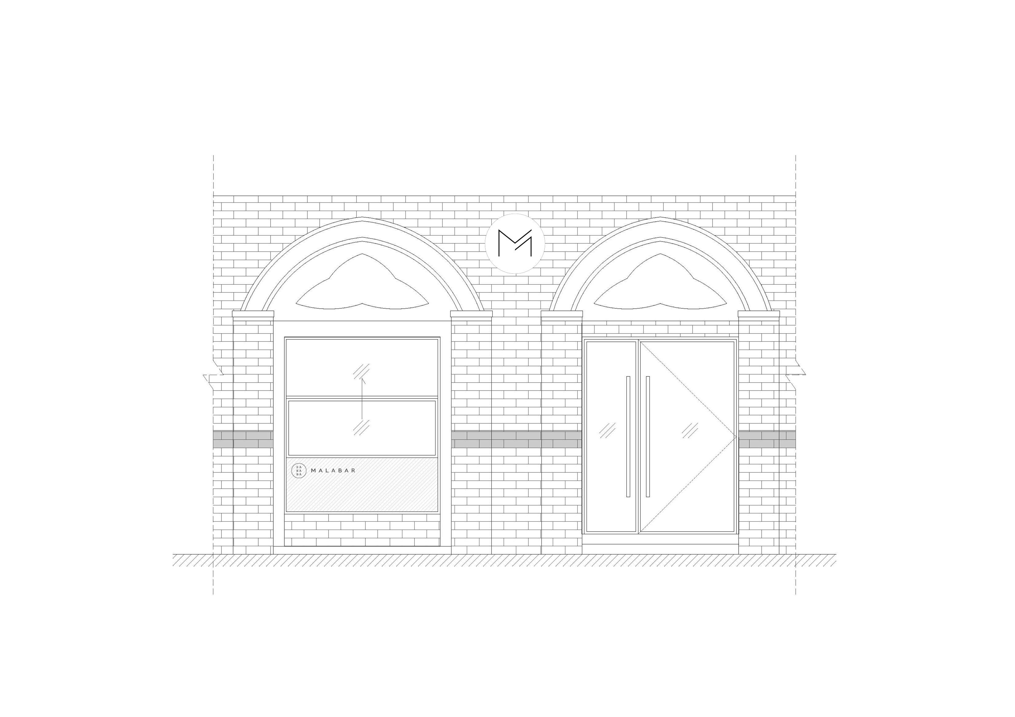
▲室外立面图
左侧内嵌式酒柜的拱形门洞设计,呼应了石库门建筑风格,而弧形也柔和了空间元素中的工业感,分隔开的门洞陈列柜,衬托着其中精心挑选的葡萄酒及清酒。
With a row of built-in wine cabinets on the left, the arched opening is intended to highlight a curated selection of wines and sake. The arch also softens the industrial feeling of some displays and breaks down the scale of the wall.
西班牙风情的铺砖及色彩元素延续着老 Malabar的基因,用餐区及洗手间的铺地都采用了精致的定制设计图案,而吧台铺地以回纹形的深色木地板区分开来;带着日式和风象征意义的图案在细节处点缀,为餐厅增添了有趣的设计细节。
The Spanish paving and color inherit the DNA of the old Malabar, with patterns symbolic in shape and style integrated with a Japanese twist. A custom designed pattern floor tile was installed in the dining area, while the area around the bar utilizes a dark-toned wood installed with a chevron pattern.
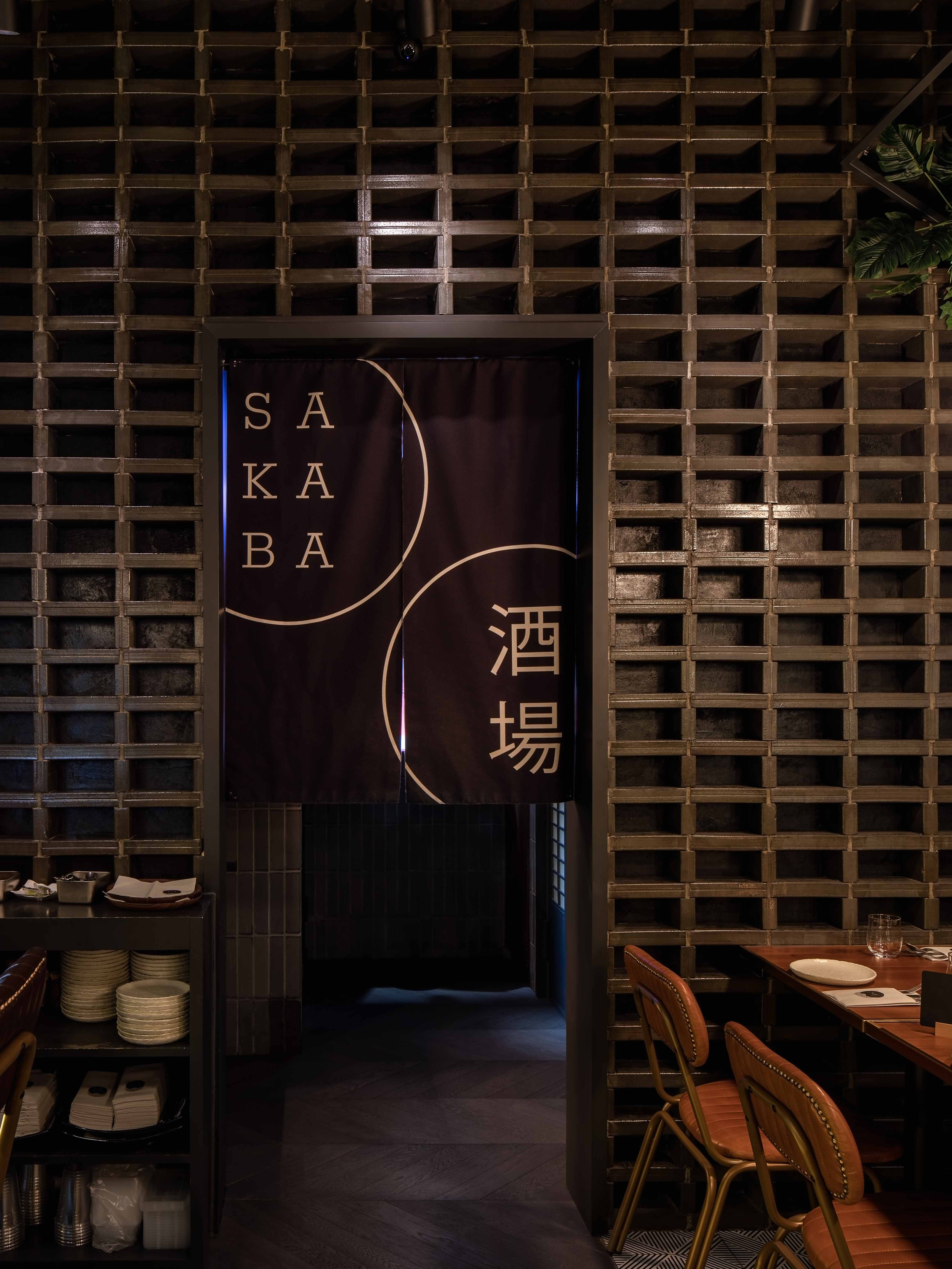
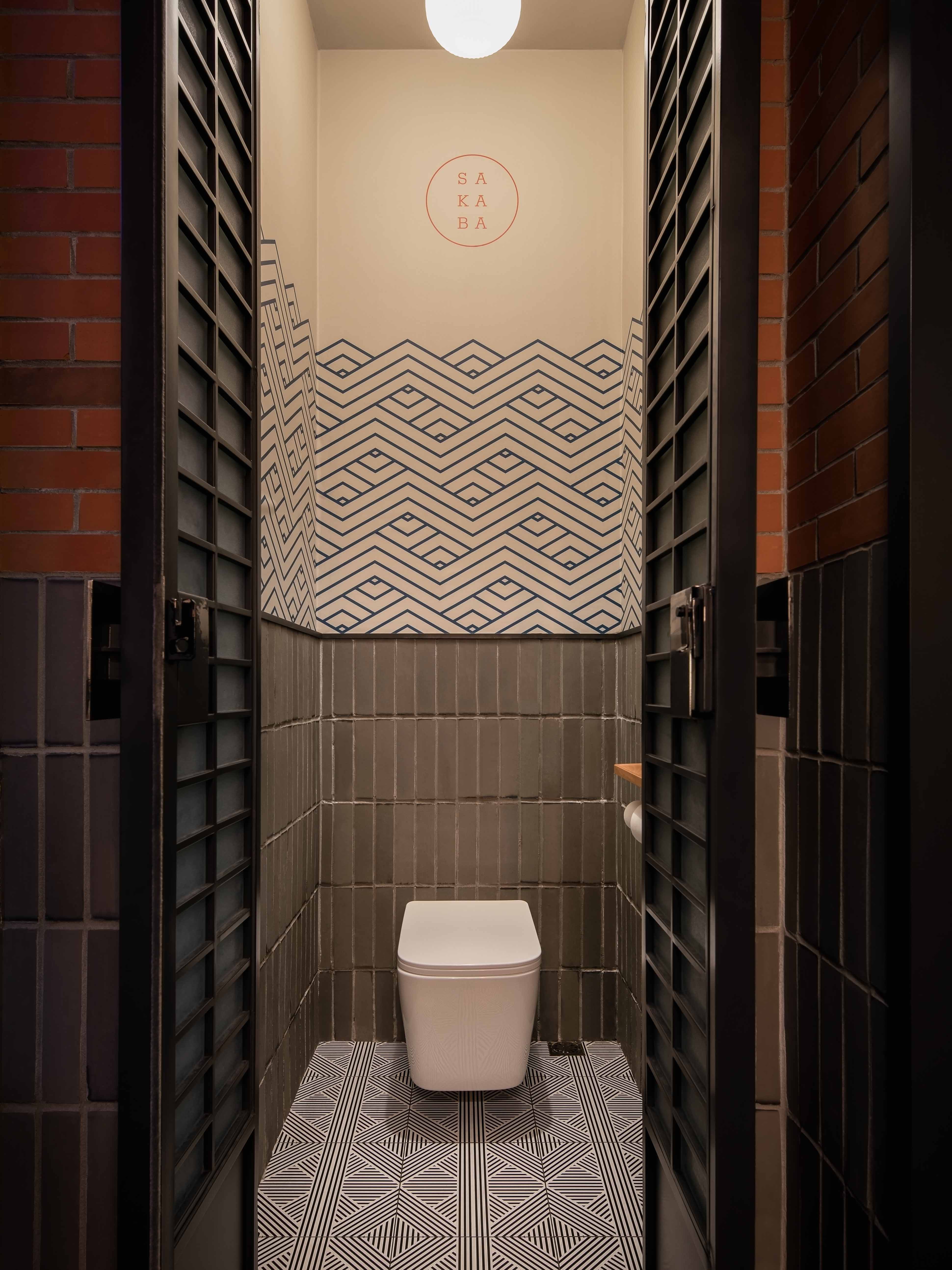
全新升级后的Malabar也更新了更精致美味的菜单,而在不经意处致敬主厨的小细节,也时刻提醒我们:一家餐厅屹立不倒的核心在于食物及人。我们希望通过设计塑造出灵魂及氛围,创造持久的体验。
With a brand-new upgraded menu that is more refined and diverse, and the small details that pay tribute to the crew, seem to remind us that the core of a long-standing restaurant is its food and people. We hope to capture the soul by creating the atmosphere with design, giving an experience that ages gracefully.
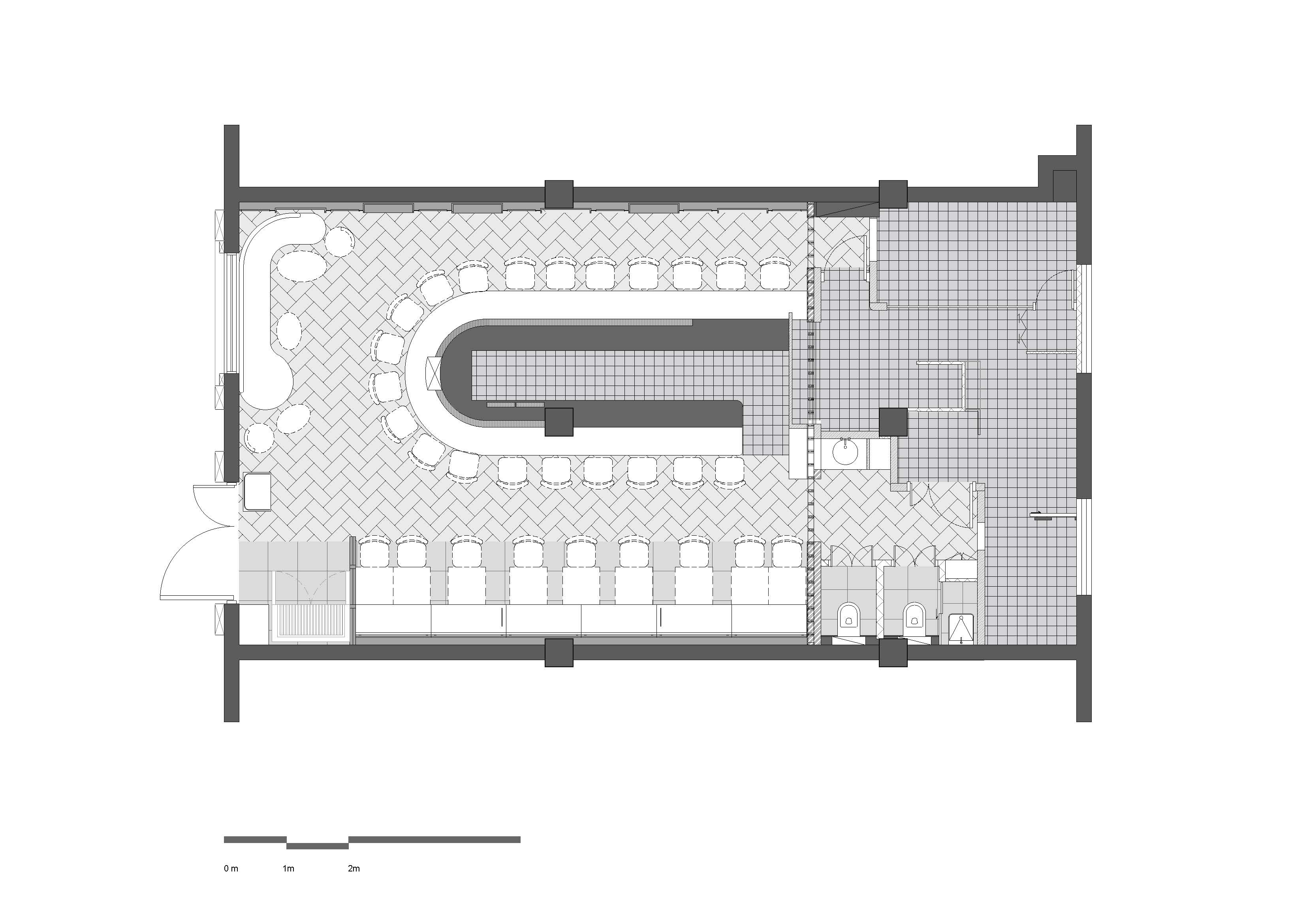
▲平面布局图
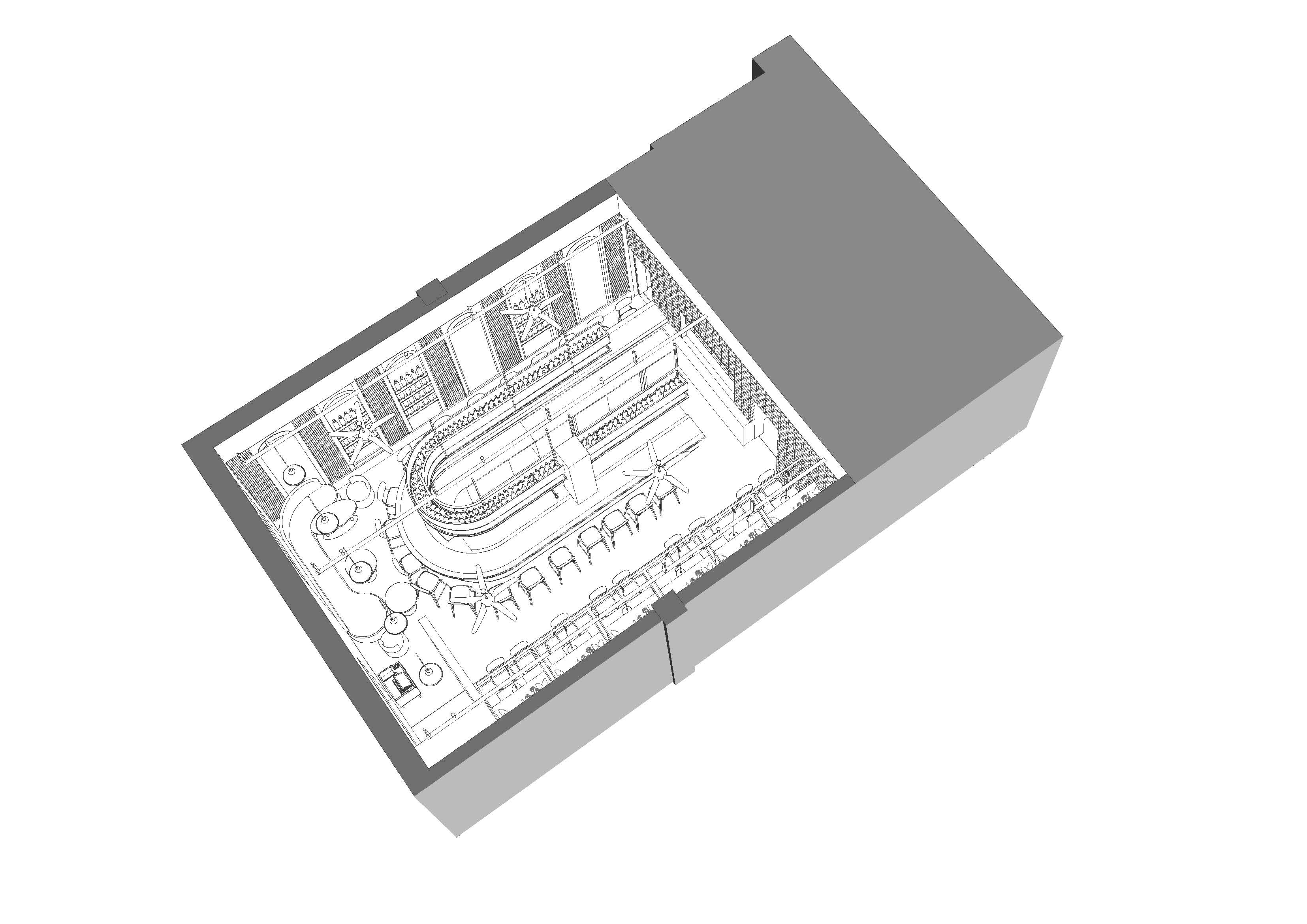
▲轴测图
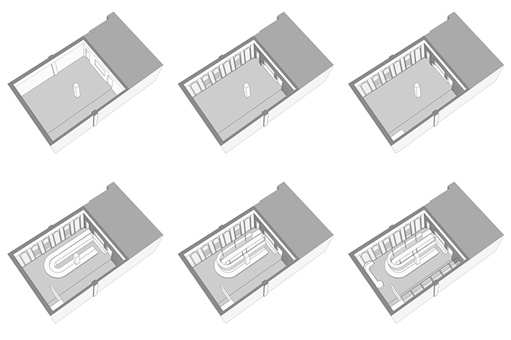
▲空间示意图
版权声明→本文由作者本人或用户及授权机构推荐发布到「游憩网」,仅代表作者观点,不代表「游憩网」立场。部分作品来源于网络,该作品仅供学习使用,非商用,如转载/链接/转贴或以其它方式使用本稿,需注明文章来源:「游憩网」及作品单位,相关疑问,请添加网站顶部投稿二维码。
在线留言