——游憩规划——
2021And move forward together
“绝大多数的事情,并非是你想清楚以后才感觉不在乎,而是你不在乎以后才突然想清楚”
作者:至岸景观 发布时间:2021-11-09 浏览量: 次
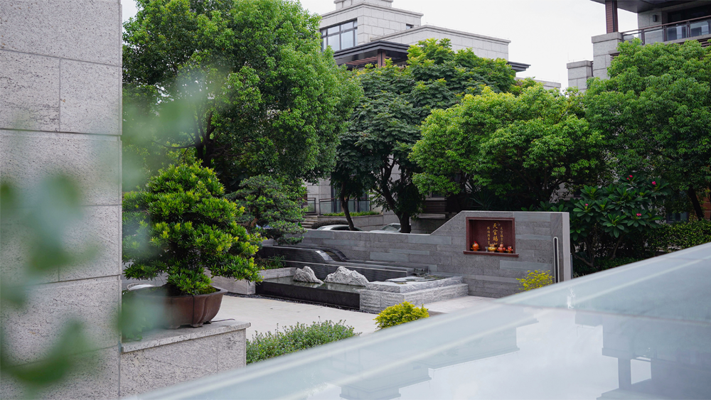
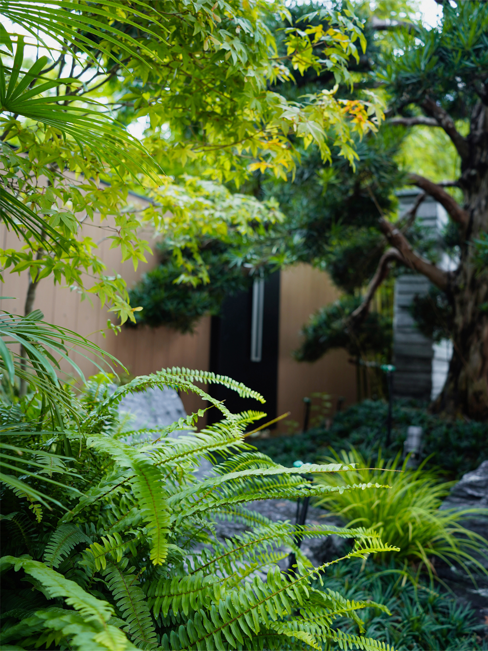
庭院景观围绕两棵松开展,这是拿到时的特定条件。第一棵松 -建筑主体是走现代感,而罗汉松自身身姿自带中式的笔墨感。想走现代感,园林美学又不能丢失传统的根源,想注入文化沉淀,又不能泥古,手法得要简洁干练。刚好做个结合。
The courtyard landscape is developed around two pine trees, which is a specific condition when it is obtained. The first pine-the main body of the building is modern, and Podocarpus owns a Chinese style of pen and ink. If you want to be modern, the garden aesthetics must not lose its traditional roots, and if you want to inject cultural deposits, it must not be old-fashioned, and the technique must be concise and capable. It just happens to be a combination.
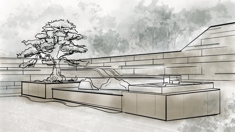
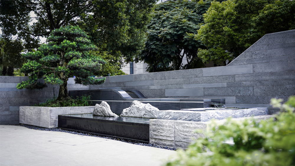

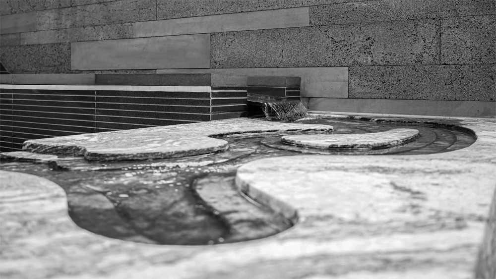
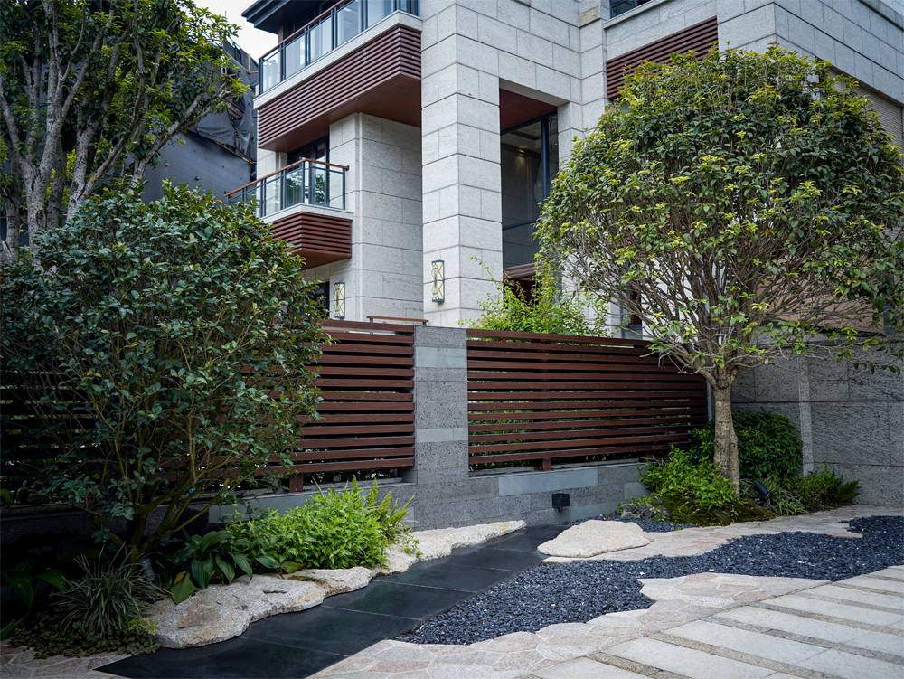
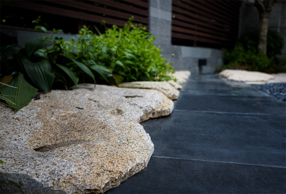
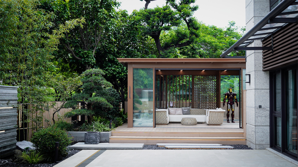
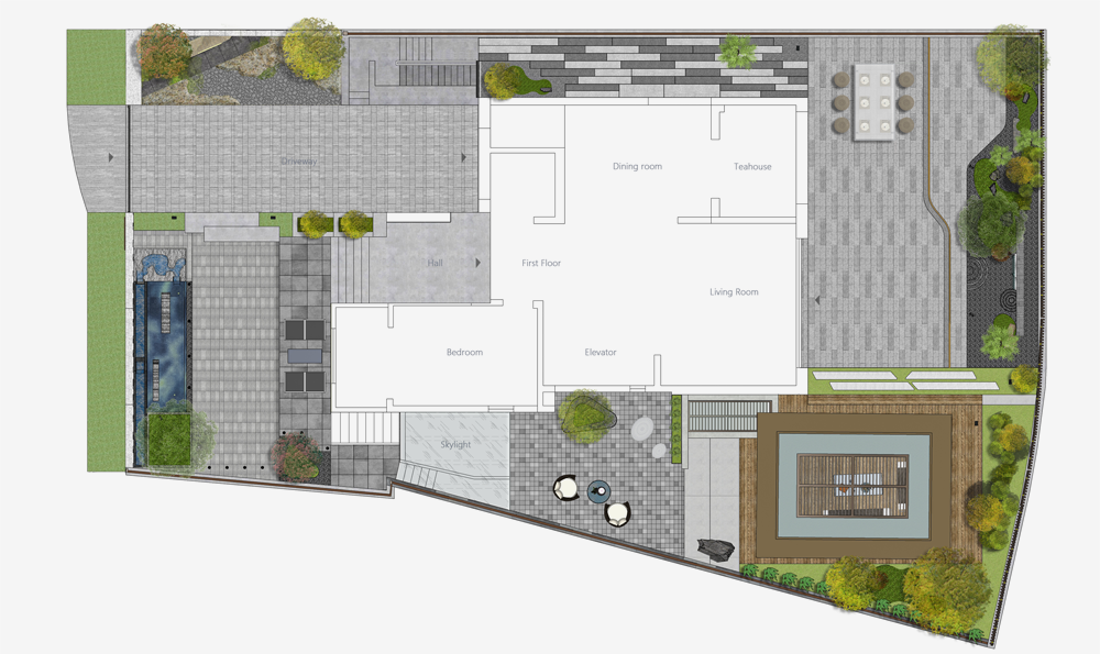
庭院的空间设计是解决居住者的空间使用问题,量身定制。此次根据需求设置不同尺度的户外茶室、会客就餐平台、儿童活动空间。
The space design of the courtyard is to solve the problem of occupants' use of space and is tailor-made. This time, outdoor tearooms, dining platforms and children's activity spaces of different scales were set up according to needs.
居住者在这些空间里如何进入,如何行进,如何室内小坐,如何透窗隔望,推门而出的刹那看什么景,都是设计开展的依凭,景观在此不是独立的内庭,都是交融的,景观在此是来升华空间的布局。
How the occupants enter these spaces, how to move forward, how to sit indoors, how to see through the window, and what scenery to see at the moment they push the door out, are all the basis of the design and development. The landscape here is not an independent inner courtyard. Blending, the landscape is here to sublimate the layout of the space.
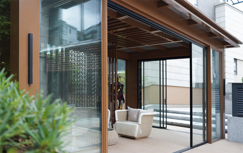
铜色铝合金廊亭,现代外观,中式造型装饰,坐落于转角,与建筑立面相迎合。起着连贯性表现效果,营造出更开阔的景观,使整个空间呈现一种衔接整体的高级美感。
Copper-colored aluminum alloy gallery pavilion, modern appearance, Chinese-style decoration, located at the corner, to cater to the building facade. It plays a coherent performance effect, creates a more open landscape, and makes the whole space present a high-level beauty that is connected to the whole.

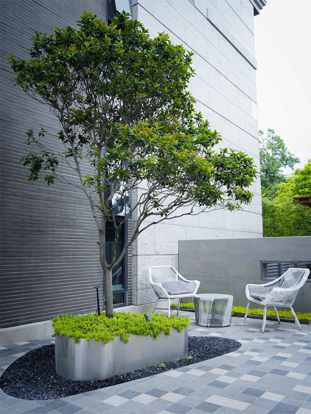
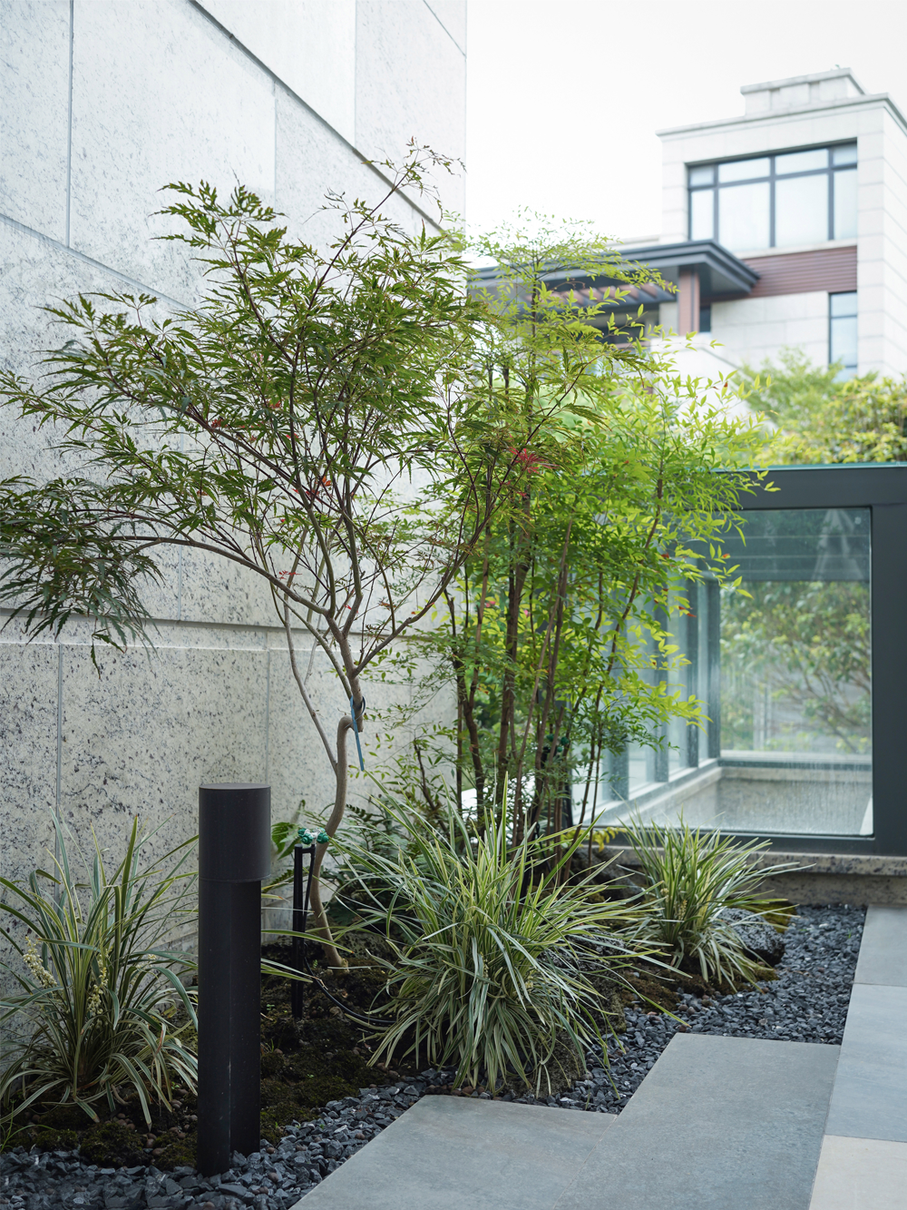
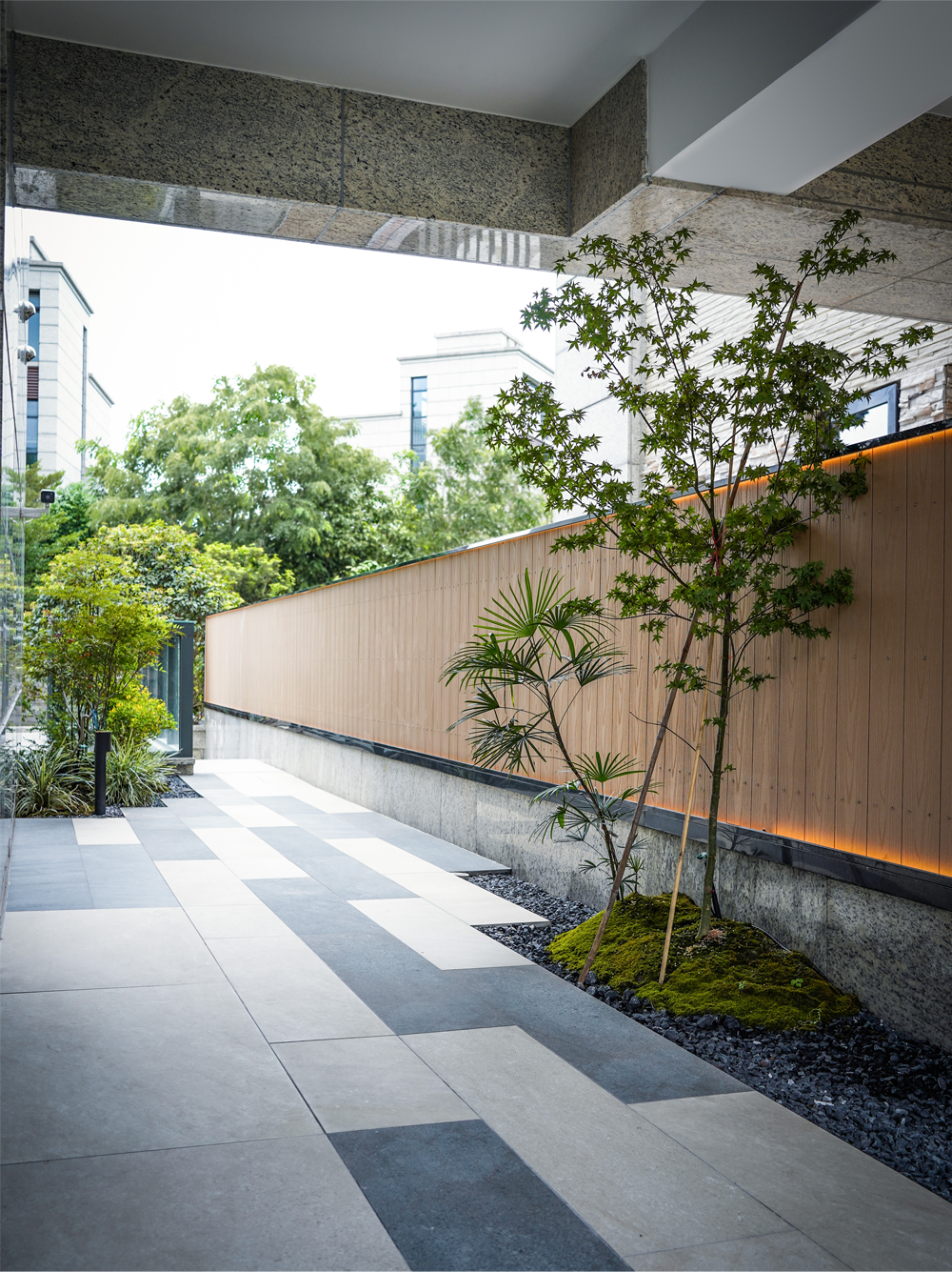
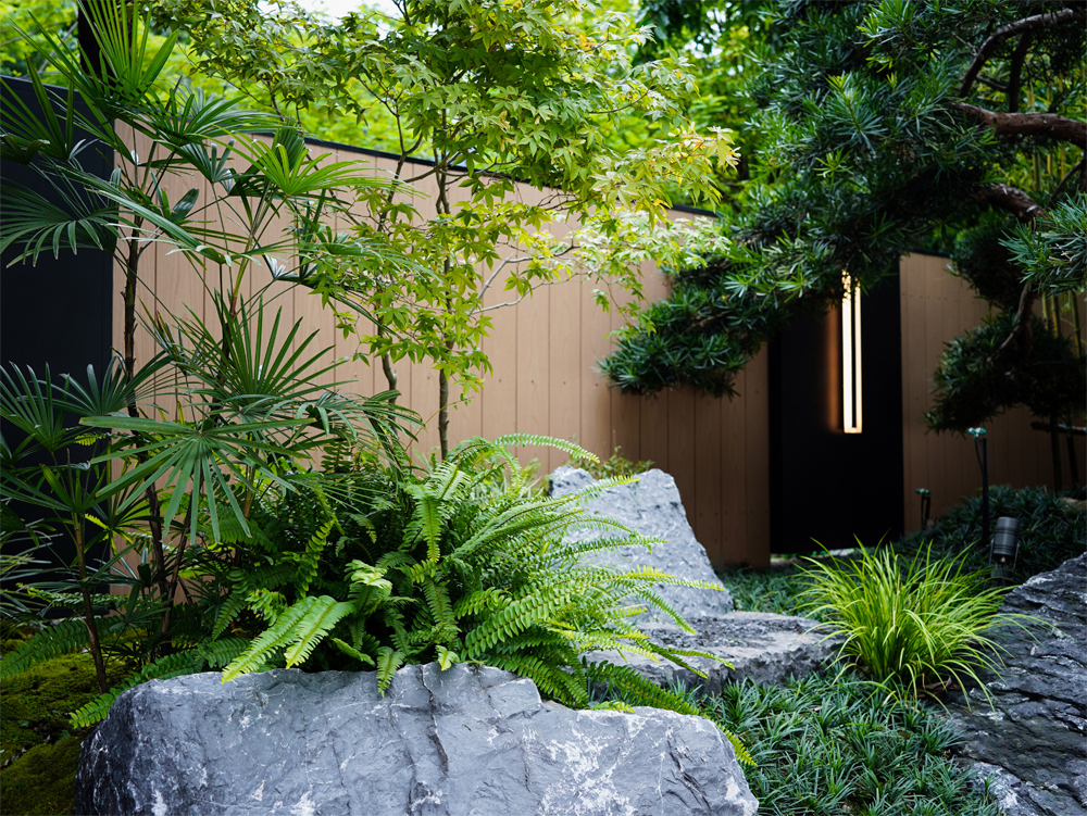
景墙将两个活动区域巧妙划分,地面采用马赛克式间铺,放大狭小空间的秩序感。植物种植槽采用拉丝面不锈钢,通过金属表面的质感和细节提升品质。平台添置户外家具,增加每处角落的实用面积,独坐、赏花、品茗,惬意活跃在每一处角落。点缀朴素无华的草木,格外透出有种生机盎然,草木摇曳间和建筑严丝合缝的交融。
The scenery wall cleverly divides the two activity areas, and the floor uses mosaic-style inter-paved to amplify the sense of order in the narrow space. The planting tank is made of brushed stainless steel, which improves the quality through the texture and details of the metal surface. Outdoor furniture is added to the platform to increase the practical area in every corner. Sitting alone, enjoying flowers, and drinking tea, you can be comfortable and active in every corner. The simple and unpretentious grass and trees are particularly vibrant, and the swaying vegetation and the building are closely integrated.
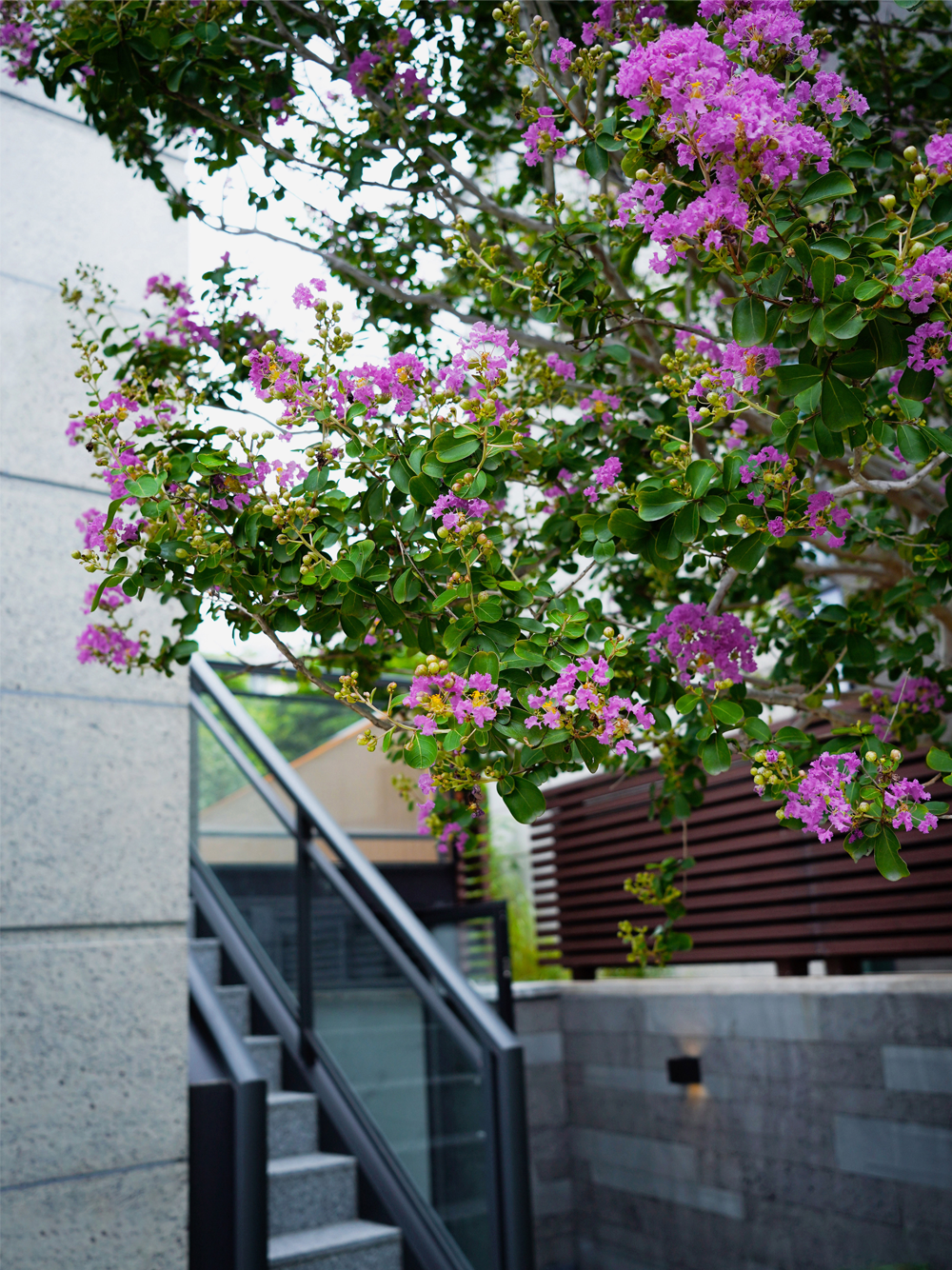
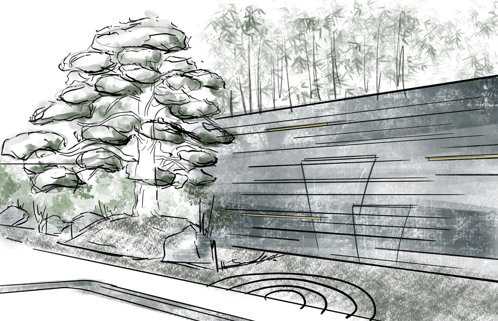
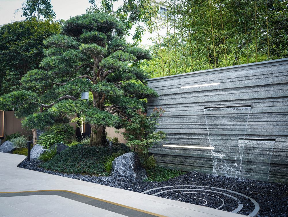
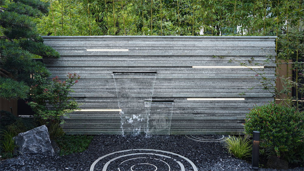
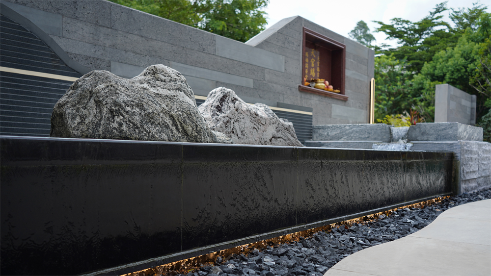
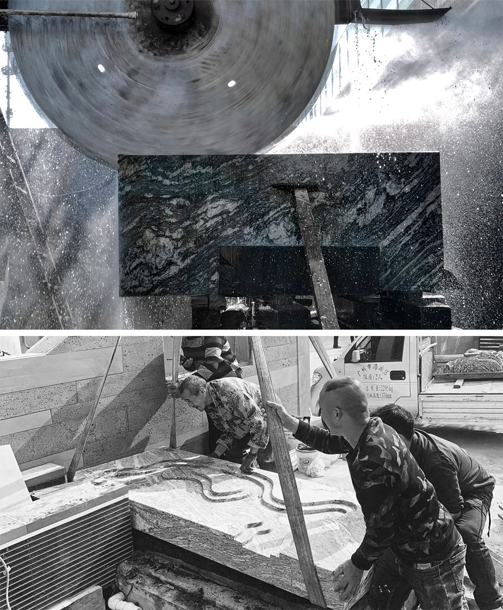
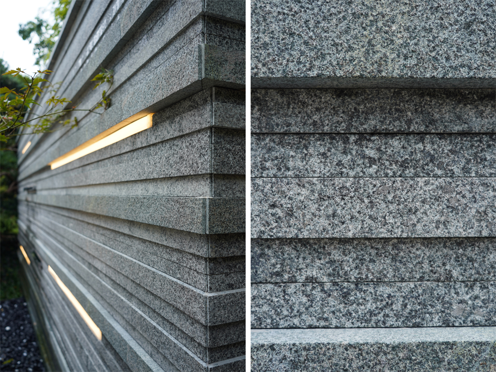
景墙定制不同面、不同长度、不同宽度不同厚度的石材,共24种组合进行排列。
与基础面做参照,进行深浅变化的拼贴组合。在选材与规格方面执着了一下,深刻去研究,淡然去呈现。选用单一材料,整体达不到夺目,也不至于凌乱,选用不同规格,梳理秩序,细看不至于平庸。
Scenery Wall customizes stones with different faces, different lengths, different widths and different thicknesses, and a total of 24 combinations are arranged. Make a reference to the base surface to make a collage combination of varying depths. Perseverance in material selection and specifications, in-depth research, and indifferent presentation. Choose a single material, the whole is not eye-catching, and it will not be messy. Choose different specifications to sort out the order, and it will not be mediocre.
平面图 FLOOR PLAN
版权声明→本文由作者本人或用户及授权机构推荐发布到「游憩网」,仅代表作者观点,不代表「游憩网」立场。部分作品来源于网络,该作品仅供学习使用,非商用,如转载/链接/转贴或以其它方式使用本稿,需注明文章来源:「游憩网」及作品单位,相关疑问,请添加网站顶部投稿二维码。
在线留言