——游憩规划——
2021And move forward together
“绝大多数的事情,并非是你想清楚以后才感觉不在乎,而是你不在乎以后才突然想清楚”
作者:DIKA迪卡设计 发布时间:2021-10-11 浏览量: 次
建筑面积:9000平方米
项目位置:云南
项目名称:云南棒棒糖理想园
项目类型:幼儿园设计
总设计师:王俊宝
设计单位:西安迪卡幼儿园设计中心
主持设计师:王俊宝,欧吉勇,谭慧敏,傅会明,陈健,常笑健,王永康,赵崇廷,魏坤
施工图深化:张琪,李强
效果图深化:常笑健,高鑫,杨茗,马鑫,周珂,李强,崔英楠,王东平,吴琳
摄影师:侯博文
总导演:王俊宝,赵成林,张孝君
副导演: 康进
灯光师:张博
业主单位:蒙自洪氏企业
项目范围:建筑设计、景观设计、室内设计
设计时间:2017年
一群固执的人,心怀未来完美蓝图,
渴望拥有一把万能钥匙,解开世间迷茫,
从广褒宇宙到尘埃,不断反复进行新的创意,
最终,用一笔一划勾勒出了,
“一个可触摸的乌托邦,一个可实现的理想国,”
这座神奇的神似“棒棒糖”的建筑到底有什么故事?
开启故事里快乐的那把钥匙是什么?
安静下来,听。
▼项目概览,project overview
实施过程 | Implement
时间从2017年走到了2019年,这种回顾总带着一些仪式感,这个造型独特形似棒棒糖的建筑,位于云南,棒棒糖理想园拥有与其他作品不同的历史,它重新定义了建筑作为学校教学和文化背景的载体,在初始设计完成的半年后,建筑开始在一个与原本设计环境完全不同的地点开始被建造。
Time is from 2017 to 2019. This review always brings some sense of ritual. This unique shape is like a lollipop. It is located in Yunnan. The lollipop ideal garden has a different history from other works. It redefines the architecture. As a vehicle for the teaching and cultural background of the school, half a year after the initial design was completed, the building began to be built in a location completely different from the original design environment.
洪氏企业创始人洪建山和洪新建两兄弟从福建来到蒙自闯荡20余年,经过不断地艰苦奋斗,创办了蒙自海华伊顿教育发展有限公司等重要项目,海华伊顿国际幼儿园坐落于云南省红河哈尼族彝族自治州蒙自市上海路,位于滇南中心的城市核心区,此项目占地十六亩,综合体以特色幼儿园为中心,围绕全市覆盖,该项目于2018年末竣工,目前已投入使用,这座建筑有效汲取当地的文化特质,具有非常独特的辨识度。
Hong Jianshan founder Hong Jianshan and Hong Xinjian two brothers came to Mengzi for more than 20 years from Fujian. After continuous hard work, they established Mengzi Haihua Eaton Education Development Co., Ltd. and other important projects. Haihua Eaton International Kindergarten is located in Yunnan. The Honghe Hani and Yi Autonomous Prefecture, Mengzi City, Shanghai Road, is located in the core area of the city center of Weinan. The project covers an area of 16 mu. The complex is centered around the city and is covered by the city. The project was completed in late 2018. When put into use, the building effectively captures the local cultural identity and has a unique recognition.
▼施工过程,construction phase

迪卡幼儿园设计中心凭借《棒棒糖理想园》荣获IDPA中日国际先锋设计大赛2018年度top10国际影响力设计机构,荣获北京798艺术设计周金奖荣获上海国际室内设计节“金外滩”最佳空间设计奖,荣获 IDEA-TOPS艾特奖西安赛区国际空间设计大赛——最佳文化空间设计奖.
Decathlon Design Center won the top10 international influence design institute of IDPA China-Japan International Pioneer Design Competition in 2018 with the “Lollipop Ideal Garden”, and won the Beijing 798 Art Design Week Gold Award and won the Best Space of Shanghai International Interior Design Festival “Gold Bund” Design Award, won the IDEA-TOPS Award for Xi’an Division International Space Design Competition – Best Cultural Space Design Award.
人生需要很多把钥匙,幼儿园是开启人生的第一把钥匙
Life needs a lot of keys, and a kindergarten is the very first key to life

这个幼儿园与其他幼儿园最大的不同在于,他设计中所有的灵感均来自孩子的艺术世界,最突出的特点是外在造型上的设计,以“钥匙”为载体,主体也以棒棒糖为造型,就像小朋友的画作,加入更多顺其自然与童真的幻想。在外在造型上也清除了孩子们对于学校的陌生和怀疑。减少了钢筋水泥的冰冷感,我们团队在不断地经历过设计,修改,调整,推敲,反复创新后,用自己的一笔一划赋予了建筑生命,创造出了最“熟悉的新鲜感”
The biggest difference between this kindergarten and other kindergartens is that all the inspiration in his design comes from the children’s art world. The most prominent feature is the design of the external shape. The key is the carrier and the main body is also shaped like a lollipop. Just like the children’s paintings, add more to the natural and childlike fantasy. The external appearance also removes the children’s strangeness and suspicion about the school. Reducing the icy feeling of reinforced concrete, after constantly experiencing design, modification, adjustment, scrutiny, and repeated innovation, the designer gave his life with a stroke and created the most “familiar freshness”.
▼鸟瞰图,aerial view
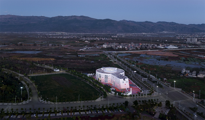
▼建筑与周围环境形成对比,the contrast to surrounding environment

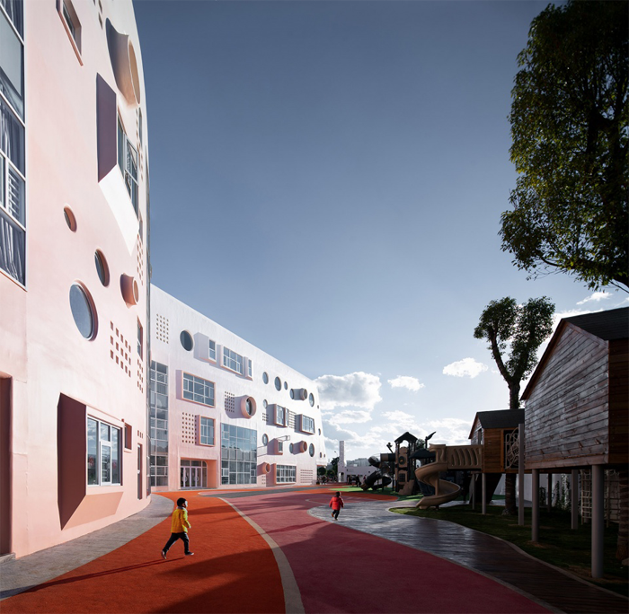
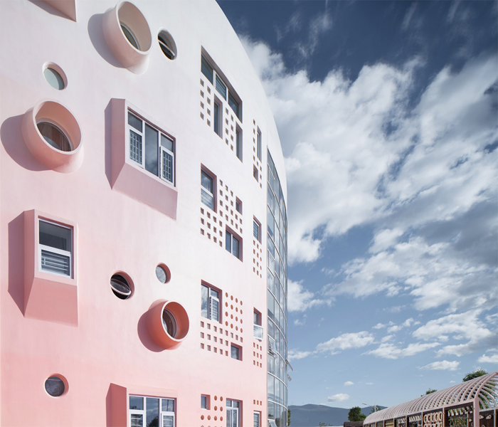
校园色彩方面借用了黎明时分天空渐变的颜色,从下往上,由深转浅,充满神秘又变换无穷的气息,色彩可以给孩子们带来不同的感受和情绪,而渐变色则可以给孩子更多的想象空间,纯粹的渐变色使色彩更加的生动缓和,不单调也也不会给视觉增加负担,设计师在极力创造一个诗意且具有艺术的世界,想要给孩子们一个奇异的世界,让他们可以在这里体验,成长,感受四季。
The color of the campus borrows the color of the sky gradient at dawn, from bottom to top, from deep to shallow, full of mystery and transforming infinite atmosphere, color can bring different feelings and emotions to children, while gradient color can give Children have more imagination space, pure gradient color makes the color more vivid and gentle, not monotonous and will not burden the vision. Designers are also trying to create a poetic and artistic world, giving children a strange world. Let them experience, grow and feel the four seasons here.
▼弧形立面,a curved facade
▼从操场望向建筑,view to the building from the playground
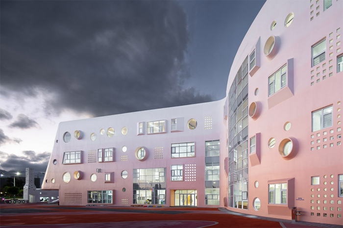
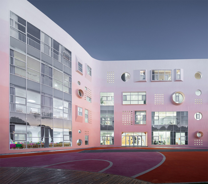
校园的每个区域都有着自己的功能,得益于天赋的自然条件,概念的立意之初,建筑师就力图创造一个可以与自然交融的校园,伴随着清晨阳光的冉冉升起,阳光打在渐变色的墙砌上,水,空气都伴随着微风自然而然的与孩子们建立起了完整的联系,孩子们一边呼吸着新鲜的空气,一边感受着自然的和谐,漫步其中,带来了非凡的体验。
Every region of the school has its own function. Thanks to the natural conditions of talent, at the beginning of the concept, the architect tries to create a campus that can blend with nature, with the rise of the morning sun, the gradient The facade of the wall, the sun hits the ground and the wall, forming a pleasant path. Under the sun, the air and the water are all accompanied by the breeze. The children have a complete connection with the children. The children breathe fresh. The air, while feeling the harmony of nature, walks through it and brings an extraordinary experience.
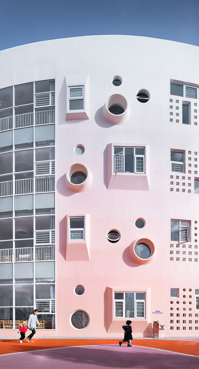
▼立面的渐变色彩给孩子带来更多的想象空间,the vibrant gradation of pink in the facade provides children with imagination
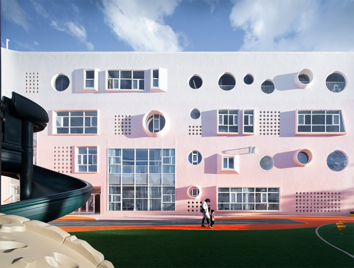
▼立面细部,facade detail
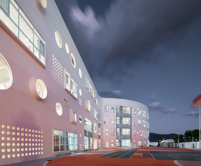
▼校园夜景,night view
新与旧的界限
Oproviding New and old boundaries
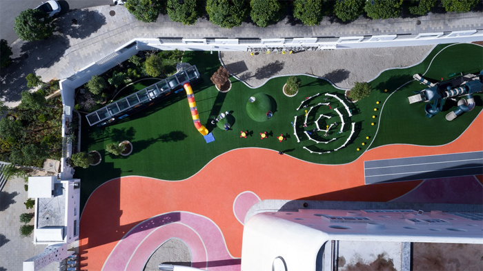
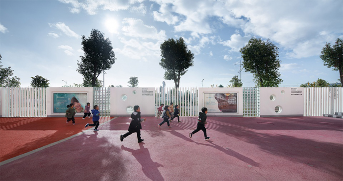
室外活动区带来有趣的碰撞 ———混凝土以及色彩的对比达成了和谐统一,新与旧的碰撞则带来了更多空间构成的可能性,室外活动区域是孩子们最主要的日常活动范围,设计师希望此区域更具有开放性和灵活性,可以满足不同年龄段学生对于空间的需求。当阳光穿梭有趣的路径时,在地面上透射出五彩斑斓,变成一个个有趣的光影游戏,正是这些小细节,让校园显得如此特别,此区域更是深受家长和孩子的广泛好评与喜爱。
The outdoor activity area brings interesting collisions—the contrast between concrete and color has reached a harmonious unity and a collision between new and old. The outdoor activity area is the main daily activity area for children. We also try to explore more space. Possibility, the designer hopes that this area is more open and flexible, to meet the needs of students of different ages. When the sun travels, the interesting path becomes a fun light and shadow game. It is these small details that make the campus look so special. This area is widely praised and loved by parents and children.
▼室外活动区鸟瞰,aerial view to the outdoor activity area
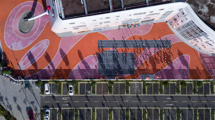
▼户外活动平台成为幼儿活动扩展空间,the outdoor platform becomes an expansion space for children’s activities
▼阳光下奔跑的孩子,children playing in the sunlight
融合民族建筑特色
Features of traditional architecture
设计团队将闽南福建土楼,哈尼族蘑菇屋的建筑结构保留下来,将传统文化元素与现代建筑相融合,置入当地特色艺术,设计师利用素朴的建筑语言表达毫无修饰的建筑内涵,并在在这个传统的躯壳里融入现代的设计手法,打造具有民族特色的质感,给孩子们留下了一个既有特色又现代的建筑作品,也更好地适应了当地孩子们的生活方式。
The design team preserved the building structure of the Fujian Tulou Building and the Hani Mushroom House, blending traditional cultural elements with modern architecture and incorporating local art. The designer uses the simple architectural language to express unadorned architectural connotations. Incorporating modern design techniques into this traditional body, it creates a texture with ethnic characteristics, leaving children with a unique and modern architectural work, and better adapted to the lifestyle of local children.
▼设计团队将闽南福建土楼,哈尼族蘑菇屋的建筑结构保留下来,the design team preserved the building structure of the Fujian Tulou Building and the Hani Mushroom House
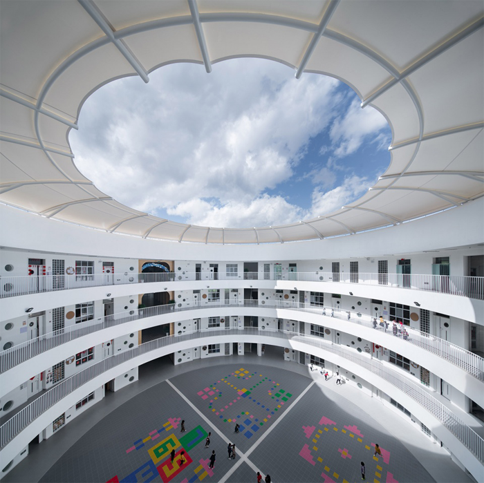
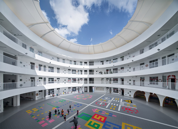
▼中庭,atrium

▼中庭内部立面,internal facade of the atrium
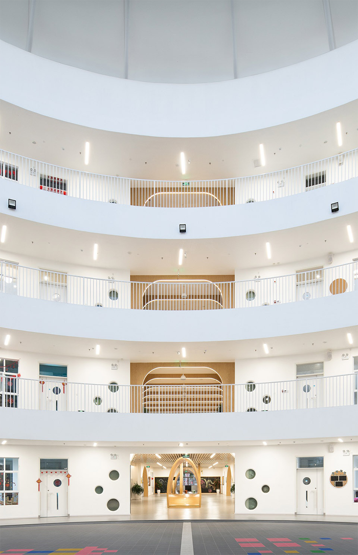
走廊外观与内部
Exterior and interior of the corridor
内部白色混凝土让建筑仿佛穿上了白色的羽毛,让你仿佛进入潘多拉之盒,拥有世间神力。
The exterior white concrete makes the building seem to wear white feathers, making you seem to enter the Pandora’s box, with the power of the world.
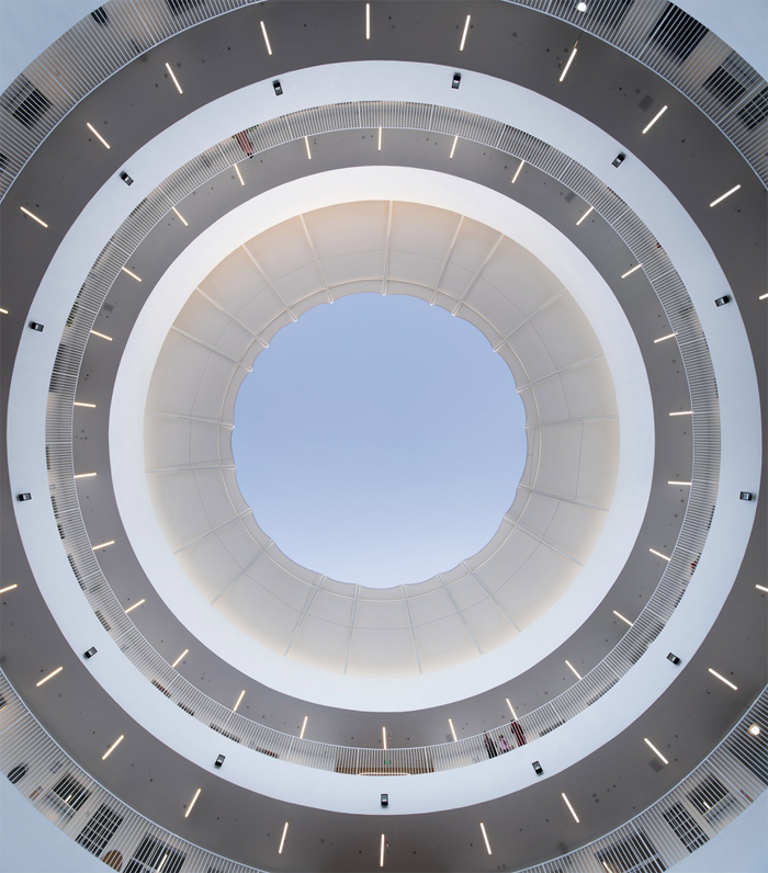
中庭空间增加了建筑的流畅感和流动性,内部空间以白色为主,地面则以彩色为主有活跃气氛的作用,中庭空间是孩子们最主要的交往场所,圆环路径,简单,统一,孩子们可以在明亮流畅的中庭肆意奔跑,也能让孩子们更自由自在的使用空间。
The atrium space increases the fluency and mobility of the building. The interior space is dominated by white. The ground is dominated by color and has an active atmosphere. The atrium space is the most important place for children to interact. The ring path is simple and unified. Children can run in the bright and smooth atrium, and they can let the children use the space more freely.
▼中庭走廊,atrium corridor
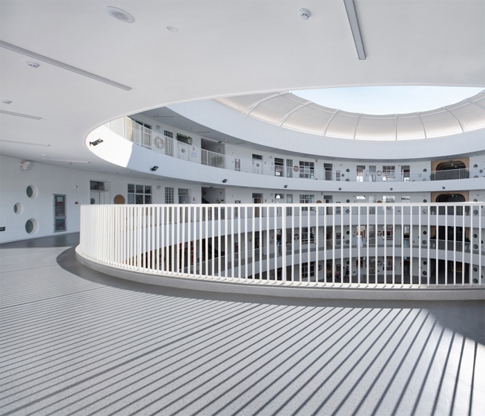
▼中庭内部宽敞的活动空间,the capacious space for children to play
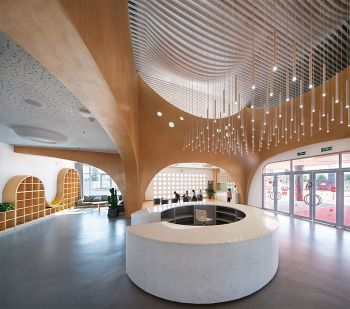
▼入口兼父母等候区,entrance waiting area
▼乐高室,lego room
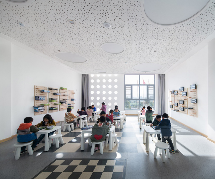
▼科学发现室,science discovery room
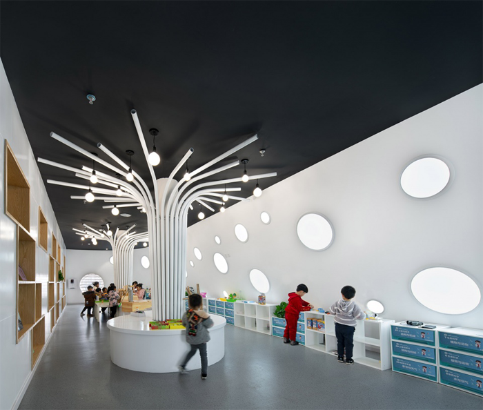
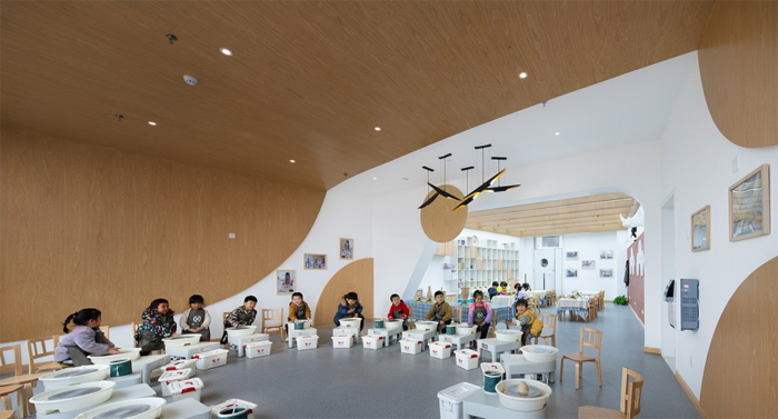
▼陶艺室,pottery room
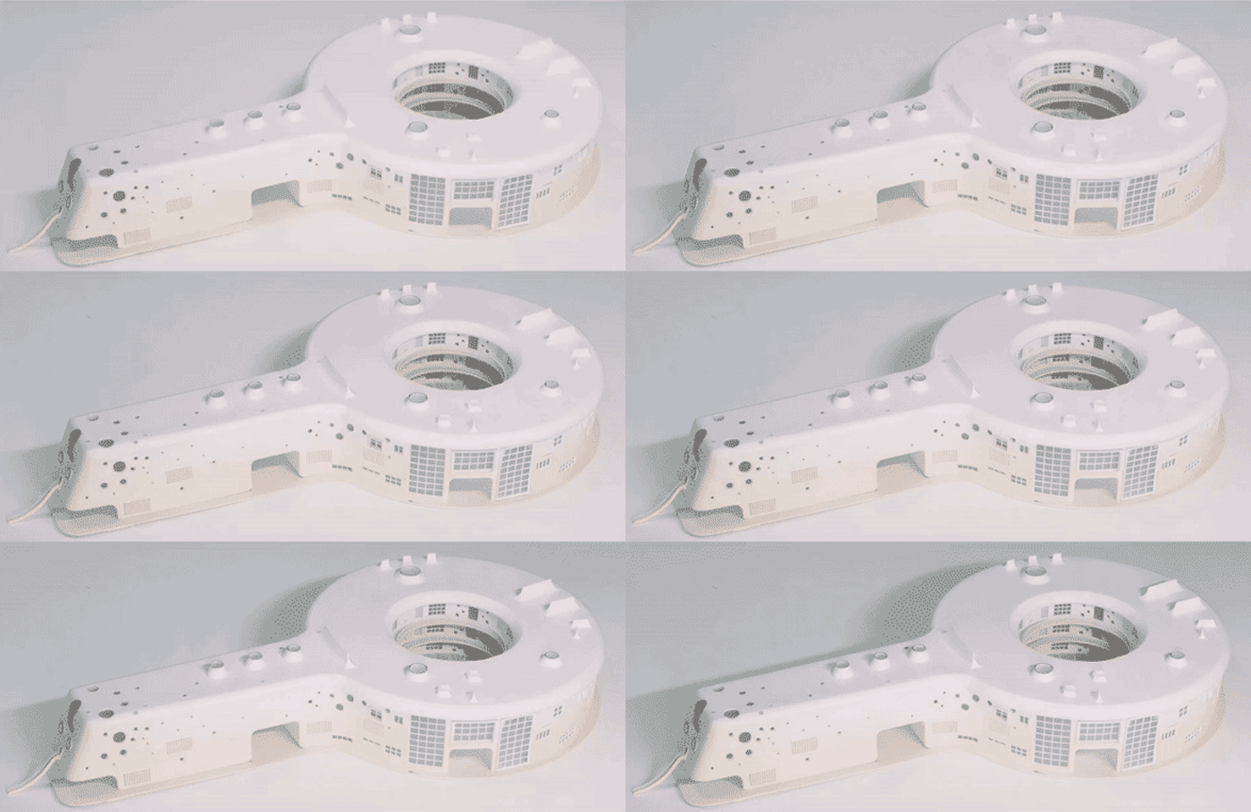
▼建筑模型,project model
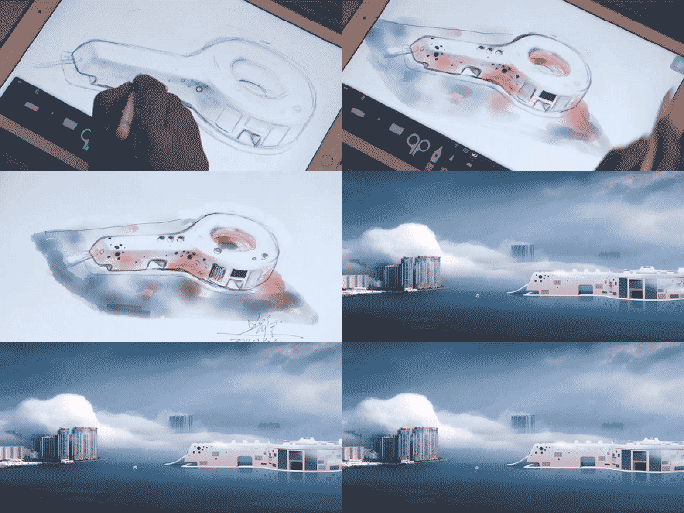
▼手绘,drawing
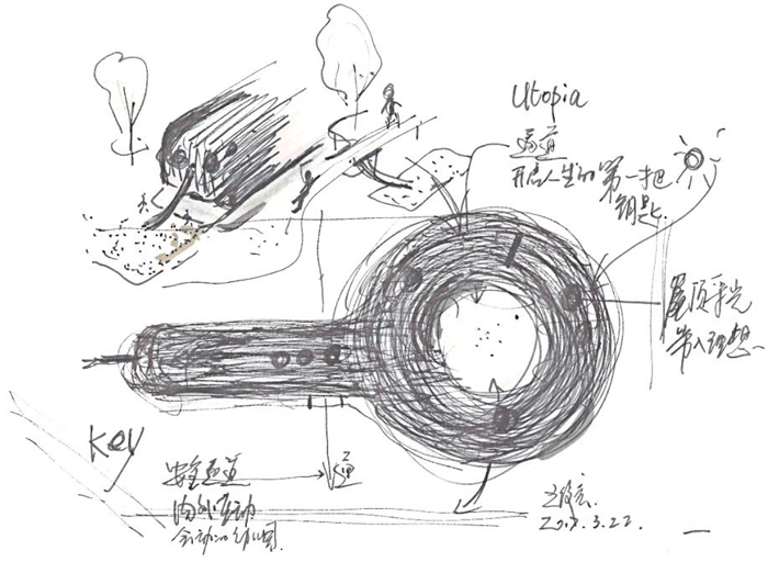
▼设计草图,design sketch
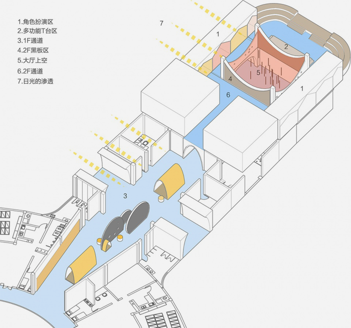
▼首层空间分布示意,1F layout diagram
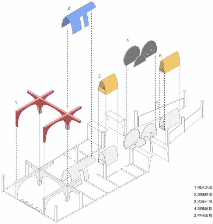
▼细部功能示意,detailed diagram
版权声明→本文由作者本人或用户及授权机构推荐发布到「游憩网」,仅代表作者观点,不代表「游憩网」立场。部分作品来源于网络,该作品仅供学习使用,非商用,如转载/链接/转贴或以其它方式使用本稿,需注明文章来源:「游憩网」及作品单位,相关疑问,请添加网站顶部投稿二维码。
在线留言